Color tokens
Our color system is built on a flexible, layered token structure that ensures consistency across design and code.
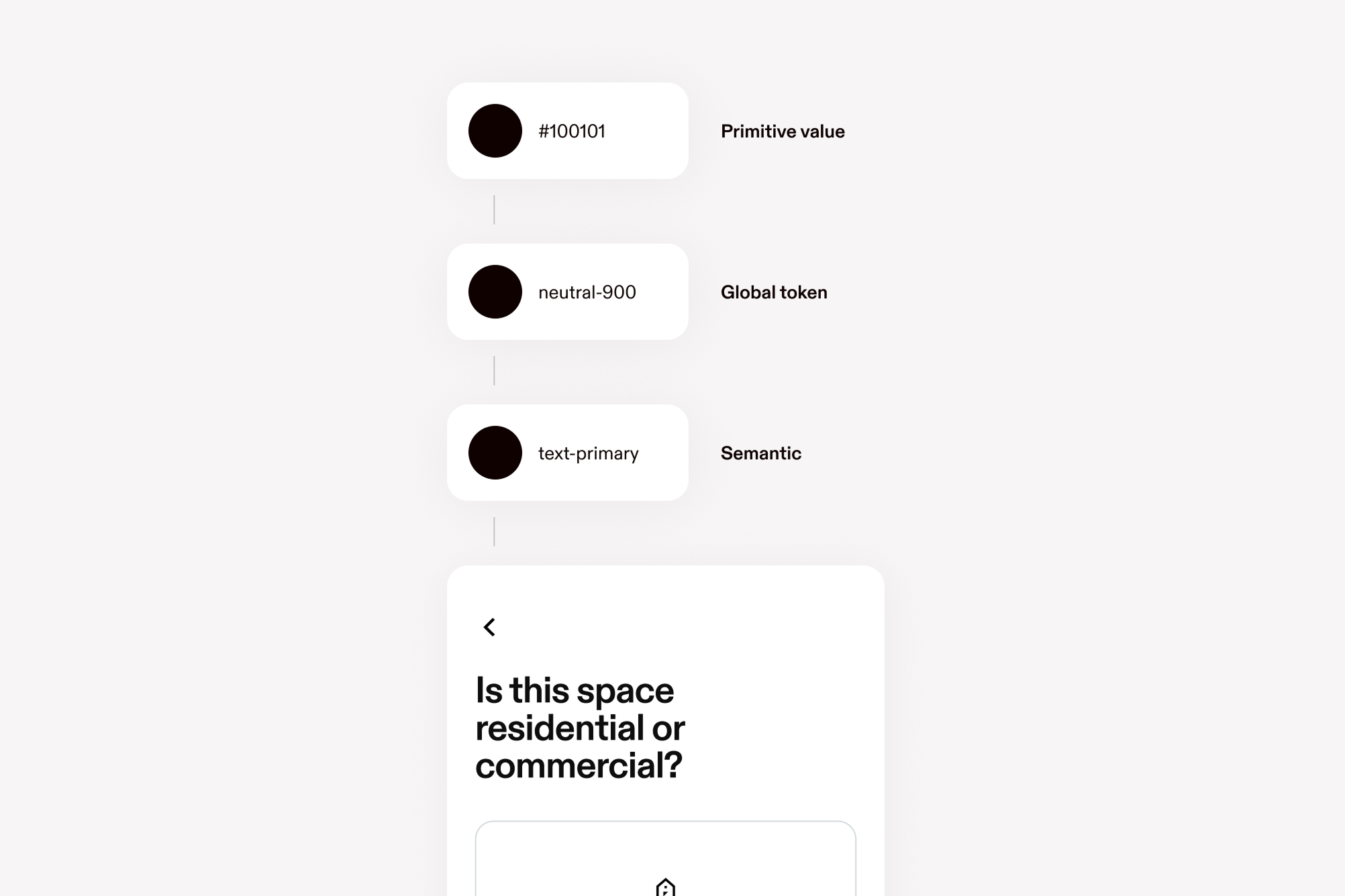
Tokens define how color is applied in interfaces—from foundational values to functional and contextual roles.
Global tokens
Color tokens begin with primitive values—the raw hues that form the base of our palette. These are not used directly but serve as the source for all applied color.
Global tokens map those primitives to functional roles in the interface, such as text, surfaces, and borders. This separation ensures simplicity, easier maintenance, and adaptability across themes like dark mode.
Neutral
textLightneutral.textLight#575757
textneutral.text#100101
strokeneutral.stroke#D2D2D2
secondaryTextneutral.secondaryTextrgba(16,1,1,0.64)
disabledneutral.disabled#808080
card, backgroundDarkneutral.card#E6E6E6
card, backgroundDarkneutral.backgroundDark#E6E6E6
backgroundneutral.background#FFFFFF
textneutral.900#100101
neutral.890#151313
neutral.875#1F1718
neutral.850#272323
neutral.825#2A2828
neutral.800#2F2F2F
neutral.700#4C4C4C
textLightneutral.600#575757
neutral.550#666666
neutral.500#666666
disabledneutral.400#808080
neutral.300#B4B4B4
strokeneutral.200#D2D2D2
neutral.150#E8E8E8
card, backgroundDarkneutral.100#E6E6E6
neutral.75#EFEFEE
neutral.50#F4F4F4
backgroundneutral.0#FFFFFF
Brand Colors
brandPurple.900#271B37
brandPurple.800#4A3D5D
brandPurple.700#726188
brandPurple.600#7438C0
brandPurple.500#9480AE
brandPurple.400#AE9DCA
brandPurple.300#C2B3D9
brandPurple.200#D1C4E6
brandPurple.100#E2DAF0
brandPurple.50#E2DAF0
baseprimary.base#2183CD
primary.900#1E2E3E
primary.800#3F5976
primary.700#5F82A6
baseprimary.600#2183CD
primary.500#769CC3
primary.400#91B4D9
primary.300#A5C5E7
primary.200#BFD5EE
primary.100#D4E4F6
primary.50#EAEFF5
brandGreen.900#1B281D
brandGreen.800#425045
brandGreen.700#647768
brandGreen.600#22783A
brandGreen.500#829484
brandGreen.400#AEBAB1
brandGreen.300#CDD7D0
brandGreen.200#DAE2DF
brandGreen.100#E6EEEB
brandGreen.50#E6EEEB
brandYellow.900#35321D
brandYellow.800#5F5A3F
brandYellow.700#837B5D
brandYellow.600#FDB70A
brandYellow.500#A09371
brandYellow.400#BAAD88
brandYellow.300#D5C9A9
brandYellow.200#E7DEC5
brandYellow.100#F0EBDE
brandYellow.50#F0EBDE
brandOrange.900#3A2C22
brandOrange.800#664B39
brandOrange.700#98735B
brandOrange.600#D9702A
brandOrange.500#BB9175
brandOrange.400#D1A283
brandOrange.300#DFBCA5
brandOrange.200#E9D2C3
brandOrange.100#F1E2D7
brandOrange.50#F1E2D7
brandRed.900#42232F
brandRed.800#7C475C
brandRed.700#AE6882
brandRed.600#C6284B
brandRed.500#C8839E
brandRed.400#DFA1B8
brandRed.300#E8B7CA
brandRed.200#EDCBD8
brandRed.100#F2D9E2
brandRed.50#F2D9E2
Semantic tokens
Semantic color tokens convey meaning and state—such as purpose of usage, success, warning, or error—within components and patterns.
These colors are strictly functional and should never be used decoratively. They help users quickly understand system status through consistent, accessible visual cues.
Background
glassInvertbackground.glassInvertrgba(16,1,1,0.48)
glassbackground.glassrgba(244,244,244,0.48)
tertiary, primarybackground.tertiary#FFFFFF
secondaryInvertbackground.secondaryInvert#151313
secondarybackground.secondary#F4F4F4
primaryInvertbackground.primaryInvert#100101
tertiary, primarybackground.primary#FFFFFF
Text
disabledInverttext.disabledInvert#666666
disabledtext.disabled#808080
secondaryInverttext.secondaryInvertrgba(255,255,255,0.64)
secondarytext.secondaryrgba(16,1,1,0.64)
primaryInverttext.primaryInvert#FFFFFF
primarytext.primary#100101
Dim
secondaryInvertdim.secondaryInvertrgba(255,255,255,0.64)
secondarydim.secondaryrgba(16,1,1,0.64)
primaryInvertdim.primaryInvertrgba(255,255,255,0.32)
primarydim.primaryrgba(16,1,1,0.32)
Stroke
primaryInvertstroke.primaryInvert#2F2F2F
primarystroke.primary#E8E8E8
Divider
primaryInvertdivider.primaryInvert#2F2F2F
primarydivider.primary#E8E8E8
Success
The success palette is used to indicate that the action the user took completed successfully.
accentInvert, primarysuccess.accentInvert#425045
accentsuccess.accent#DAE2DF
backgroundInvertsuccess.backgroundInvert#1B281D
backgroundsuccess.background#E6EEEB
secondaryInvert, secondary, basesuccess.secondaryInvert#22783A
secondaryInvert, secondary, basesuccess.secondary#22783A
primaryInvertsuccess.primaryInvert#CDD7D0
accentInvert, primarysuccess.primary#425045
secondaryInvert, secondary, basesuccess.base#22783A
backgroundInvertsuccess.900#1B281D
accentInvert, primarysuccess.800#425045
success.700#647768
secondaryInvert, secondary, basesuccess.600#22783A
success.500#829484
success.400#AEBAB1
primaryInvertsuccess.300#CDD7D0
accentsuccess.200#DAE2DF
backgroundsuccess.100#E6EEEB
success.50#F2F6F7
Warning
The warning palette warns users about non-blocking problems or events.
accentInvert, primarywarning.accentInvert#5F5A3F
accentwarning.accent#E7DEC5
backgroundInvertwarning.backgroundInvert#35321D
background, primaryInvertwarning.background#F0EBDE
secondaryInvert, secondarywarning.secondaryInvert#D9702A
secondaryInvert, secondarywarning.secondary#D9702A
background, primaryInvertwarning.primaryInvert#F0EBDE
accentInvert, primarywarning.primary#5F5A3F
basewarning.base#FDB70A
backgroundInvertwarning.900#35321D
accentInvert, primarywarning.800#5F5A3F
warning.700#837B5D
basewarning.600#FDB70A
warning.500#A09371
warning.400#BAAD88
warning.300#D5C9A9
accentwarning.200#E7DEC5
background, primaryInvertwarning.100#F0EBDE
warning.50#F8F5ED
Danger
Use the danger palette around blocking problems or events, or to indicate destructive actions.
accentInvert, primarydanger.accentInvert#7C475C
accentdanger.accent#EDCBD8
backgroundInvertdanger.backgroundInvert#42232F
background, primaryInvertdanger.background#F8EBF1
secondaryInvertdanger.secondaryInvert#F64C62
secondary, basedanger.secondary#C6284B
background, primaryInvertdanger.primaryInvert#F8EBF1
accentInvert, primarydanger.primary#7C475C
secondary, basedanger.base#C6284B
backgroundInvertdanger.900#42232F
accentInvert, primarydanger.800#7C475C
danger.700#AE6882
secondary, basedanger.600#C6284B
danger.500#C8839E
danger.400#DFA1B8
danger.300#E8B7CA
accentdanger.200#EDCBD8
danger.100#F2D9E2
background, primaryInvertdanger.50#F8EBF1
Transparency
For most uses, we recommend using overlayLight and overlayDark.
The palettes below are use cases where a specific level of transparency is
required. For example, lightAlpha800 equals neutral0 at 80% opacity.
lightAlpha.900rgba(255, 255, 255, 0.92)
lightAlpha.800rgba(255, 255, 255, 0.8)
lightAlpha.700rgba(255, 255, 255, 0.64)
lightAlpha.600rgba(255, 255, 255, 0.48)
lightAlpha.500rgba(255, 255, 255, 0.48)
lightAlpha.400rgba(255, 255, 255, 0.24)
lightAlpha.300rgba(255, 255, 255, 0.16)
lightAlpha.200rgba(255, 255, 255, 0.08)
lightAlpha.100rgba(255, 255, 255, 0.06)
lightAlpha.50rgba(255, 255, 255, 0.04)
darkAlpha.900rgba(16, 1, 1, 0.92)
darkAlpha.800rgba(16, 1, 1, 0.8)
darkAlpha.700rgba(16, 1, 1, 0.64)
darkAlpha.600rgba(16, 1, 1, 0.48)
darkAlpha.500rgba(16, 1, 1, 0.48)
darkAlpha.400rgba(16, 1, 1, 0.24)
darkAlpha.300rgba(16, 1, 1, 0.16)
darkAlpha.200rgba(16, 1, 1, 0.08)
darkAlpha.100rgba(16, 1, 1, 0.06)
darkAlpha.50rgba(16, 1, 1, 0.04)
React
See the style props documentation for the complete list of style props that use the color scale.
<HStack sx={{ div: { height: '400', width: '400' } }}>
  <Center bg="neutral.200" color="primary.900">
    ☺
  </Center>
  <Center bg="primary.200" color="primary.400">
    ☺
  </Center>
  <Center bg="success.base" color="success.900">
    ☺
  </Center>
  <Center bg="warning.base" color="warning.900">
    ☺
  </Center>
  <Center bg="warning.200" color="warning.400">
    ☺
  </Center>
  <Center bg="danger.base" color="danger.900">
    ☺
  </Center>
  <Center bg="danger.200" color="danger.400">
    ☺
  </Center>
</HStack>
Bootstrap
Use the background and color utilities to apply system colors.
<div class="hstack gap-200">
  <div
    class="bg-neutral-800 text-neutral-0 w-size-400 h-size-400 d-flex align-items-center justify-content-center"
  >
    ☺
  </div>
  <div
    class="bg-primary-200 text-primary-400 w-size-400 h-size-400 d-flex align-items-center justify-content-center"
  >
    ☺
  </div>
  <div
    class="bg-success text-success-900 w-size-400 h-size-400 d-flex align-items-center justify-content-center"
  >
    ☺
  </div>
  <div
    class="bg-warning text-warning-900 w-size-400 h-size-400 d-flex align-items-center justify-content-center"
  >
    ☺
  </div>
  <div
    class="bg-warning-200 text-warning-400 w-size-400 h-size-400 d-flex align-items-center justify-content-center"
  >
    ☺
  </div>
  <div
    class="bg-danger text-danger-900 w-size-400 h-size-400 d-flex align-items-center justify-content-center"
  >
    ☺
  </div>
  <div
    class="bg-danger-200 text-danger-400 w-size-400 h-size-400 d-flex align-items-center justify-content-center"
  >
    ☺
  </div>
</div>