Design System

Components

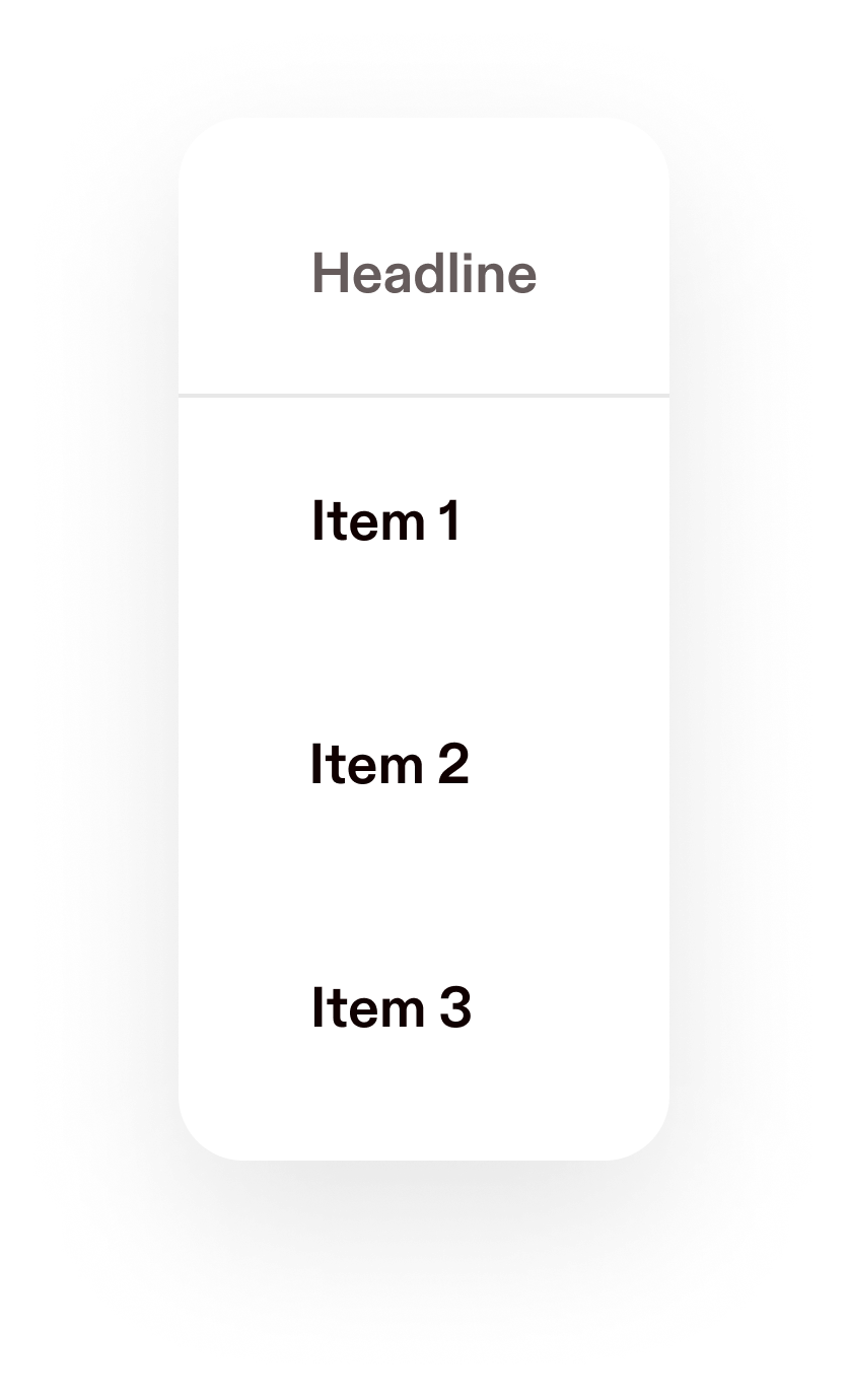
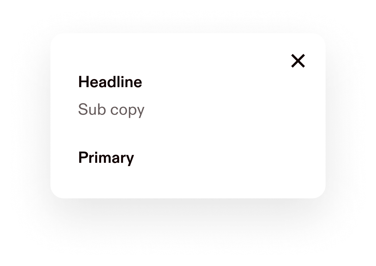
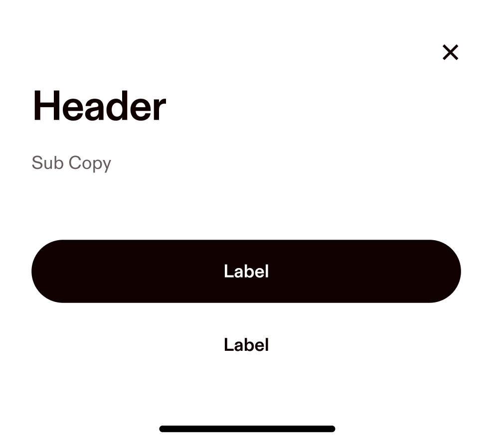
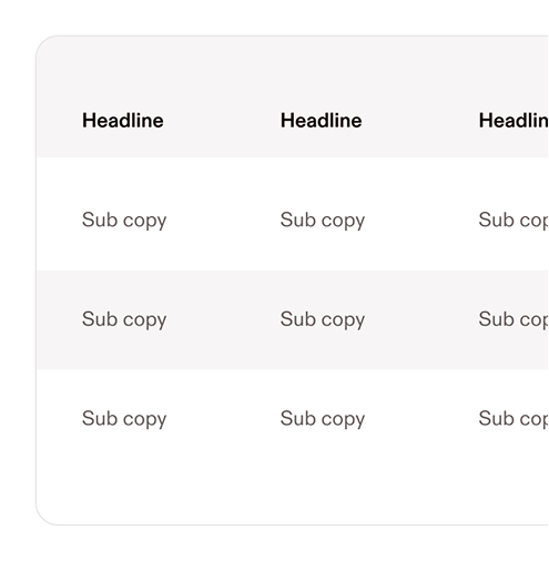
Components are the reusable building blocks of our interface. From buttons and forms to navigation and modals, each one is designed for consistency, accessibility, and ease of use. Use them to move faster, stay aligned, and build with confidence.

Accordion

Alert

Avatar

Label

Badge

Binary Button

Body Copy

Body

Buttons

Checkbox

CheckButton

Code

Code

Text input with Heading and a chevron icon on right

Dropdown

Gallery

Four column fuchsia grid

Grid

Heading

Heading

Icon

IconButton

Link

Link

Processing...Processing...

Loader

LoadingOverlay

Loading

LoadingState

Dropdown menu with heading and 3 items

Menu

Modal with header, text, and two buttons

Modal

Pictogram

PinInput

Popover with close button and 3 levels of text

Popover

Progress

Radio

RadioButton

SearchInput

Choose an option...

Select

Sample sheet with heading, text, and two buttons

Sheet

Content

Skeleton

Slider

Sample table with alternating gray and white rows

Table

Tabs

Textarea

TextInput

Label

Sub Copy

Tile

Dark color toast element with text and label

Toast

Toggle

Sample tooltip with white text on dark background

Tooltip


Copyright © 2025 Hover Inc. All Rights Reserved.