Logo
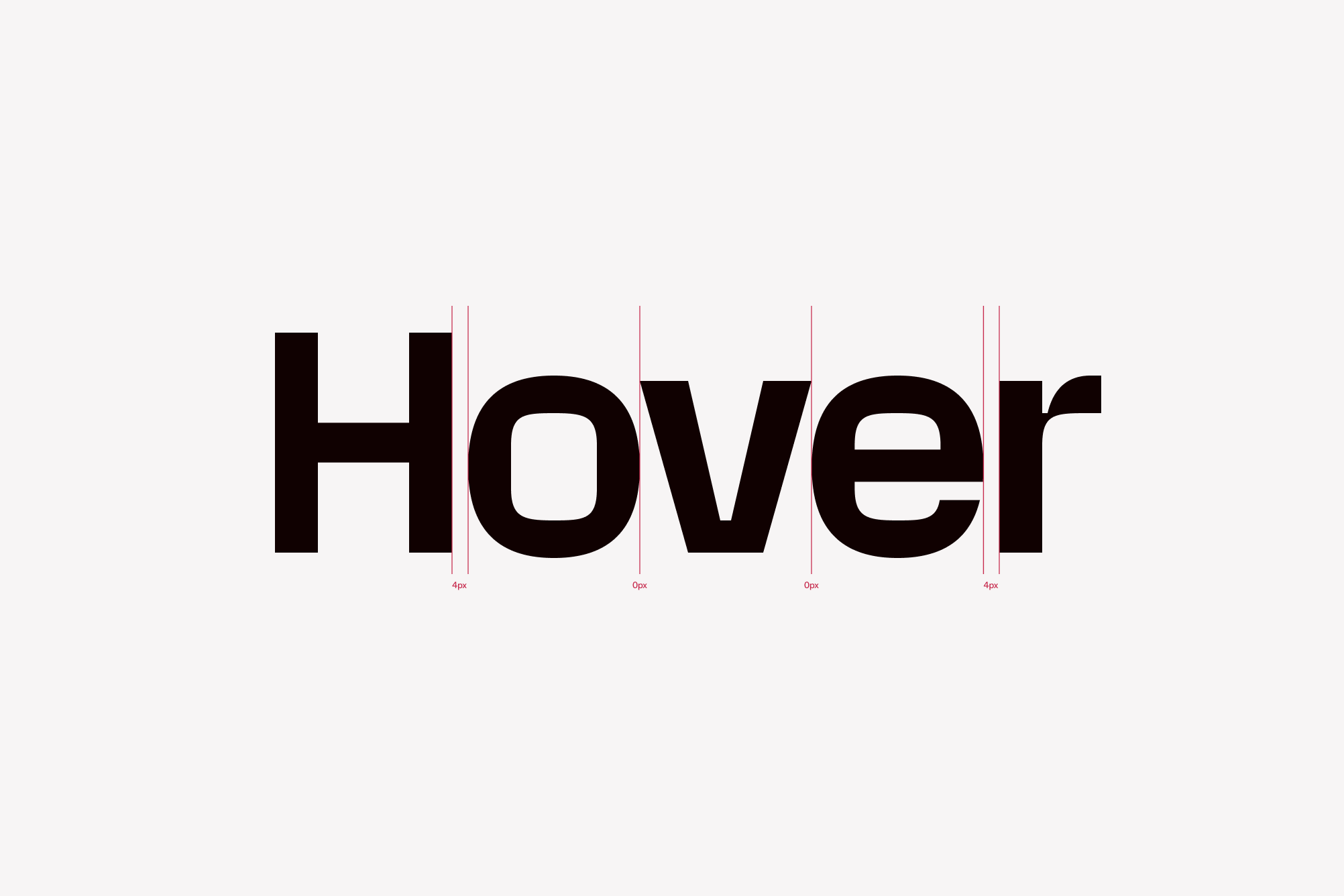
Our logo is built on a precise grid to ensure consistency, balance, and clarity at every size. Optical principles like overshoot, anisotropic contrast, and counterform shaping guide its construction—resulting in a mark that feels both refined and unmistakably legible.

Color mode
The logo color modes are straightforward and neutral. The logo exists in black and white.
The logo can be placed on black, white, fuchsia or blue backgrounds.
Partner lockup
When pairing our logo with a partner’s, use the defined lockup options to ensure consistency. Equal spacing is applied to both logos and the dividing line between them.
Use the Partnership logo lockup component in Figma for correct application.

Logo on color
The white logo can be placed on either fuchsia or blue backgrounds. Use fuchsia for Hover and Homeowner branding, and blue when representing Pros. This ensures clarity and alignment across audiences.
What not to do
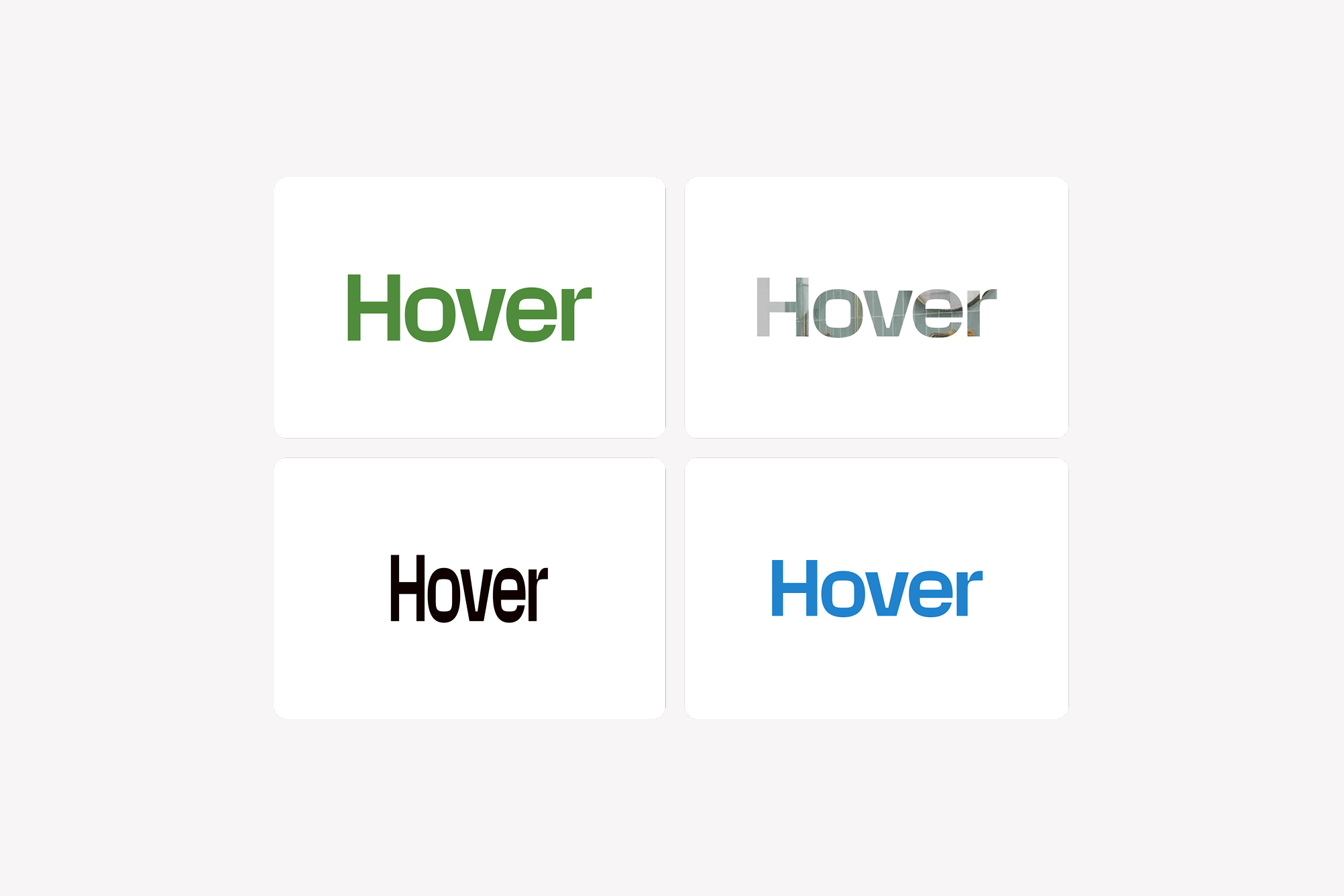
To protect the integrity of our brand, never alter the logo’s appearance. Avoid using unapproved colors, distorting its proportions, or applying it as a mask.

React
Use the Logo component to render a Hover logo
Import
import { Logo } from '@hoverinc/design-system-react-web';
Usage
Props
| Property | Type | Default | Description |
|---|---|---|---|
colorMode | dark, light | light | Light or dark mode |