Layers
Layers are sets of styles that can be applied to any container. They separate the container visually from its background content.
Blur
Blur layers apply a blur effect to the container's background. Usually, a glass layer should be used, but blur is available for cases where a custom background color needs to be applied in combination with the blur effect.
Blur 50: Used in the construction of glass components like badge, button and smaller area components.
Blur 100: Used in the construction of glass components like toast and larger area components.
Glass
Glass layers apply a glass effect to the container's background. Glass is usually applied to containers on top of media such as images.
Glass 50: Use for smaller elements, such as Badge.
Glass 100: Use for larger elements, such as Toast and cards.
React
Layer styles can be applied using the layerStyle prop on any component. The
available layer styles are as follows.
| Token | Description |
|---|---|
blur.50 | Light blur effect |
blur.100 | Strong blur effect |
glass.50 | Glass effect for smaller elements |
glass.100 | Glass effect for larger elements |
Blur
Blur styles should always be used in combination with a translucent background color.
<Box
  aspectRatio="3/4"
  backgroundImage="url(/images/documentation/foundations/layers/example-house-1.png)"
  backgroundSize="cover"
  borderRadius="large"
  display="block"
  padding="300"
  width="240px"
>
  <Badge
    backgroundColor="backgroundGlass"
    color="textPrimary"
    layerStyle="blur.50"
  >
    Blur
  </Badge>
</Box>
Glass
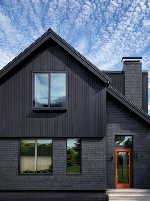
Glass styles should always be used in combination with a translucent background color.
<HStack spacing="500" flexWrap="wrap" justifyContent="center">
  <Box
    aspectRatio="3/4"
    backgroundImage="url(/images/documentation/foundations/layers/example-house-1.png)"
    backgroundSize="cover"
    borderRadius="large"
    display="block"
    padding="300"
    width="240px"
  >
    <Badge
      backgroundColor="transparent"
      color="neutral.0"
      layerStyle="glass.50"
    >
      Glass
    </Badge>
  </Box>
  <Box
    aspectRatio="3/4"
    backgroundImage="url(/images/documentation/foundations/layers/example-house-2.png)"
    backgroundSize="cover"
    borderRadius="large"
    display="block"
    padding="300"
    width="240px"
  >
    <Badge
      backgroundColor="transparent"
      color="textPrimary"
      layerStyle="glass.50"
    >
      Glass
    </Badge>
  </Box>
</HStack>