Typography
Typography defines the foundation for clear and consistent communication across our products. It establishes hierarchy, readability, and rhythm, ensuring our interfaces feel cohesive across every screen size and platform.
Accessibility

Specs
Heading
Heading / XXL
font-family: Hover Diatype;
font-weight: Bold or 700;
font-size: 72px;
line-height: 72px;
letter-spacing: -0.02em;
Heading / XL
font-family: Hover Diatype;
font-weight: Bold or 700;
font-size: 48px;
line-height: 48px;
letter-spacing: -0.02em;
Heading / Large
font-family: Hover Diatype;
font-weight: Bold or 700;
font-size: 32px;
line-height: 32px;
letter-spacing: -0.02em;
Heading / Medium
font-family: Hover Diatype;
font-weight: Bold or 700;
font-size: 24px;
line-height: 24px;
letter-spacing: -0.02em;
Heading / Small
font-family: Hover Diatype;
font-weight: Bold or 700;
font-size: 16px;
line-height: 20px;
letter-spacing: 0em;
Heading / XS
font-family: Hover Diatype;
font-weight: Bold or 700;
font-size: 14px;
line-height: 20px;
letter-spacing: 0em;
Body
Body / Medium
font-family: Hover Diatype;
font-weight: Regular or 400;
font-size: 16px;
line-height: 20px;
letter-spacing: 0em;
Body / Small
font-family: Hover Diatype;
font-weight: Regular or 400;
font-size: 14px;
line-height: 20px;
letter-spacing: 0em;
Body / Footnote
font-family: Hover Diatype;
font-weight: Regular or 400;
font-size: 12px;
line-height: 16px;
letter-spacing: 0em;
Body / Label
font-family: Hover Diatype;
font-weight: Bold or 700;
font-size: 12px;
line-height: 16px;
letter-spacing: 0em;
Font Family
| Name | Value |
|---|---|
| Heading | Diatype, Helvetica Neue, Helvetica, Arial, sans-serif |
| Body | Diatype, Helvetica Neue, Helvetica, Arial, sans-serif |
Font Weight
| Body, Heading | Aliases |
|---|---|
| 400 / 400 | normal, display, body |
| 700 / 700 | bold, heading, bodyBold |
Hover Diatype
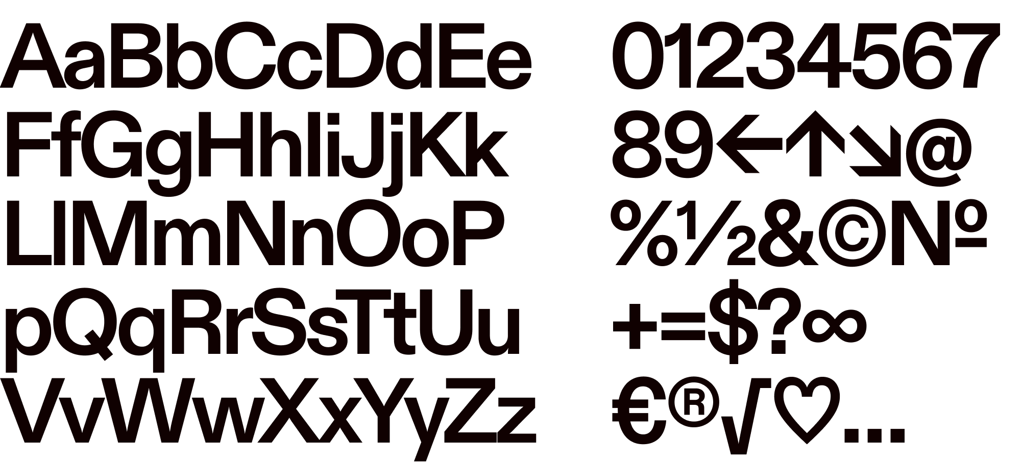
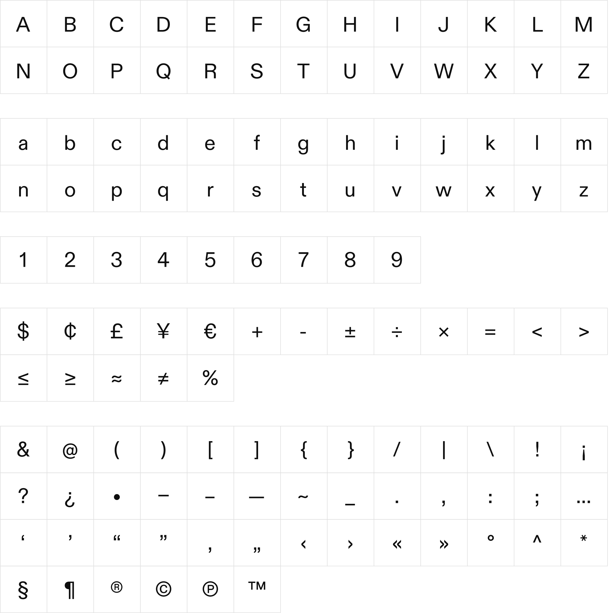
Diatype is a warm yet sharp grotesque ideal for text and reading on screen. Its name refers to the clunky, pre-digital typesetting machines that informed its shapes and the Swiss Neo-grotesque genre at large.

Type scale
The type scale creates a balanced system of sizes and line heights that adapts across breakpoints. It ensures clarity, hierarchy, and consistency whether used in dense interfaces or large, expressive layouts.
4.5
Hover 72Hover Diatype 724
Hover 64Hover Diatype 643.5
Hover 56Hover Diatype 563
Hover 48Hover Diatype 482.5
Hover 40Hover Diatype 402
Hover 32Hover Diatype 321.75
Hover 28Hover Diatype 281.5
Hover 24Hover Diatype 241.25
Hover 20Hover Diatype 201
Hover 16Hover Diatype 160.875
Hover 14Hover Diatype 140.75
Hover 12Hover Diatype 12Usage
Font size and height
React
Use a preset size by either using the Heading
or Body component or by applying a
textStyle before overriding
fontSize or lineHeight.
React Native
On React Native, fonts must be loaded asynchronously before text can render. Use
Expo's useFonts hook from expo-font to load the Hover Diatype font family,
and defer rendering until the fonts are ready:
import { useFonts } from 'expo-font';const Fonts = ({ children }) => { const [isFontLoaded] = useFonts({ 'HoverDiatype-Regular': require('@hoverinc/tokens-typography/assets/diatype-regular.otf'), 'HoverDiatype-Regular-Italic': require('@hoverinc/tokens-typography/assets/diatype-regular-italic.otf'), 'HoverDiatype-Bold': require('@hoverinc/tokens-typography/assets/native/diatype-bold.otf'), 'HoverDiatype-Bold-Italic': require('@hoverinc/tokens-typography/assets/native/diatype-bold-italic.otf'), }); if (!isFontLoaded) return null; return <>{children}</>;};
Wrap your app (or the DesignSystemProvider) with this component so that
Heading and
Body render with the correct font family. The
font assets are shipped in @hoverinc/tokens-typography.
Font Scaling
React Native respects the user's device font size setting automatically. All
design system text components (Body, Heading, ButtonText, TextInput) and
their compound wrappers (Radio, Checkbox, Toggle, Toast, Badge,
Field) cap scaling at 1.35x via maxFontSizeMultiplier. No extra work is
needed when using these components directly.
In Storybook, a font scale slider is available in the controls panel to
simulate different font scales from 1.0 to 1.35 without changing device
settings. It defaults to the device's current font scale via
PixelRatio.getFontScale().
For testing purposes, FontScaleProvider from
@hoverinc/design-system-react-native can wrap a subtree to simulate a custom
font scale without changing device settings. This is what powers the Storybook
slider. It is not needed in the production app — React Native handles font
scaling natively via the OS accessibility setting.
Extending text components with styled()
When creating a custom text component that extends Body or Heading, use
BodyBase or HeadingBase instead to preserve Tamagui's styled()
composition. Then pass scaled font props from the parent component:
import { styled } from '@tamagui/core';import { getScaledBodyProps, useFontScale } from '../../config/fontScale';import { BodyBase, BodySizes } from '../Body';// 1. Use BodyBase (not Body) when extending with styled()const CardLabel = styled(BodyBase, { size: 'small', color: '$colorDimmed',});// 2. In the parent component, read the font scale and spread scaled propsconst Card = ({ title }: { title: string }) => { const fontScale = useFontScale(); return ( <CardLabel {...getScaledBodyProps(BodySizes.Small, fontScale)}> {title} </CardLabel> );};
Key rules:
- Use
BodyorHeadingdirectly in JSX for automatic scaling. - Use
BodyBaseorHeadingBasewhen creating new styled components viastyled(). TheBody/Headingwrappers areforwardRefcomponents that handle scaling internally, butstyled()needs the raw Tamagui component to extend properly. - Call
useFontScale()in the parent component and pass scaled props usinggetScaledBodyProps(size, fontScale). - The
sizeargument must match the Body size variant set on the styled component (BodySizes.Small,BodySizes.Medium, etc.). - For components that only set
fontSizewithoutlineHeight(likeTextInput), usegetScaledFontSize(token, fontScale, fontFamily)instead.
Bootstrap
Heading and Body preset sizes are baked into <h1> through <h6>
elements or corresponding .heading-* class.
Accessibility
We aim for WCAG 2.2 level AA color contrast, i.e. 4.5:1 in most cases.
The default colors we ship for type in Heading and Body meet this standard when on the default background. If you're using a custom color or background color, please confirm the color contrast before delivering designs.
For more details about our color palettes, see the color tokens documentation.
Line length
Running text that spans multiple lines at standard screen sizes should adhere to best practices for line length. That means ensuring that no line of type in running text contains more than about 66-72 characters including spaces and punctuation, regardless of text size.