Design System

Shadows

React

A set of shadow presets are available to be applied to any system component via the shadow or boxShadow style prop.


<Box shadow="default">Shadow Box</Box>

Shadow

Standard shadows used to create the appearance of depth or layers.

live

function Shadows() {
const Shadow = props => (
<Panel as={Center} height="600" {...props}>
<Code size={400}>{props.shadow}</Code>
</Panel>
);
return (
<Stack direction="row" spacing="400">
<Shadow shadow="default" />
</Stack>
);
}

Inset

Inset shadows are the inverse of distance, for creating an inlay effect.

live

function Insets() {
const Inset = props => (
<Panel as={Center} height="600" {...props}>
<Code size={400}>{props.shadow}</Code>
</Panel>
);
return (
<Stack direction="row" spacing="400">
<Inset shadow="inset100" />
<Inset shadow="inset200" />
</Stack>
);
}

Halo

Border effects applied via CSS box-shadow to prevent affecting the dimensions of a container. These are usually used to indicate focus or selection.

live

function Halos() {
const Halo = ({ shadow, colorScheme }) => (
<Panel shadow={shadow} as={Center} height="600">
<Code colorScheme={colorScheme} size={400}>
{shadow}
</Code>
</Panel>
);
return (
<Stack direction="row" spacing="400">
<Halo shadow="haloNeutral" colorScheme="neutral" />
<Halo shadow="haloPrimary" colorScheme="primary" />
<Halo shadow="haloDanger" colorScheme="danger" />
<Halo shadow="haloWarning" colorScheme="warning" />
<Halo shadow="haloSuccess" colorScheme="success" />
</Stack>
);
}

Ring

Similar to Halo above, but thinner.

live

function Rings() {
const Ring = ({ shadow, colorScheme }) => (
<Panel shadow={shadow} as={Center} height="600">
<Code colorScheme={colorScheme} size={400}>
{shadow}
</Code>
</Panel>
);
return (
<Stack direction="row" spacing="400">
<Ring shadow="ringNeutral" colorScheme="neutral" />
<Ring shadow="ringPrimary" colorScheme="primary" />
</Stack>
);
}

Legacy

Deprecated

These shadows are deprecated in favor of a singular default. They will likely be removed in a future version.

live

function Shadows() {
const Shadow = props => (
<Panel as={Center} height="600" {...props}>
<Code size={400}>{props.shadow}</Code>
</Panel>
);
return (
<Stack direction="row" spacing="400">
<Shadow shadow="distance100" />
<Shadow shadow="distance200" />
<Shadow shadow="distance300" />
<Shadow shadow="distance400" />
<Shadow shadow="distance500" />
<Shadow shadow="distance600" />
</Stack>
);
}

React Native

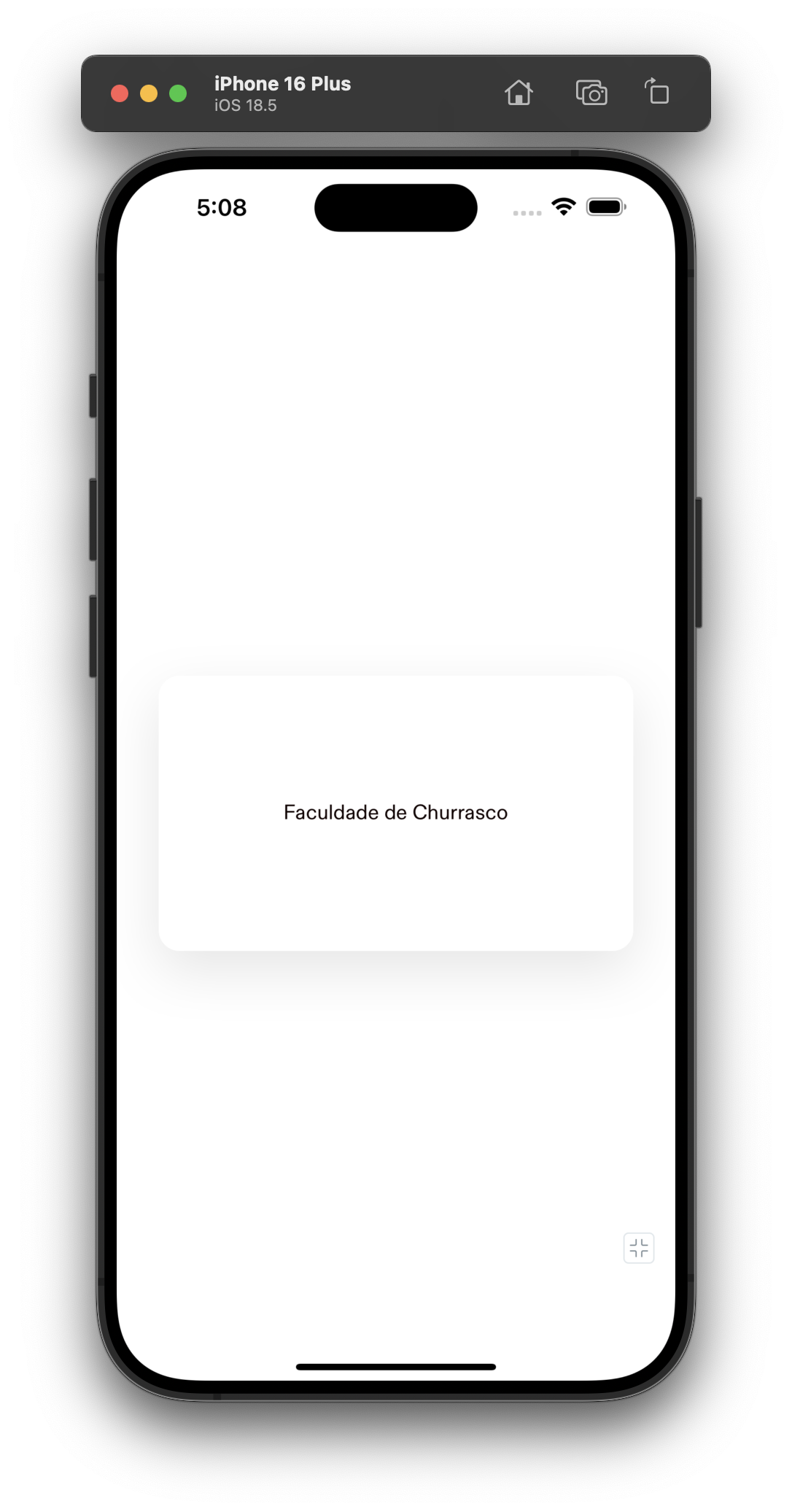
To achieve drop shadow effect in React Native you can leverage the Shadow component, which builds on top of Stack and leverages the boxShadow property available in React Native 19 through the New Architecture.


import { Body, Shadow } from '@hoverinc/design-system-react-native';
const App = () => (
<Shadow
alignItems="center"
borderRadius="$large"
justifyContent="center"
padding="$1000"
>
<Body>Faculdade de Churrasco</Body>
</Shadow>
);

Screenshot of minimum viable Shadow

Copyright © 2025 Hover Inc. All Rights Reserved.