Avatar
Display a representation of a user—their photo, initials, or a general icon on a background.
React
Avatar composes Chakra's Avatar component.
| Property | Type | Default | Description |
|---|---|---|---|
name | string | - | User's full name, used to generate initials and color |
src | string | - | User's profile image |
size | sm, md, lg | md | Size of avatar |
States
These states are implicit based on the information provided. An image will be
shown if provided—otherwise Avatar will try and parse the user's initials from
the name you provide. If you don't provide anything it shows a user icon.
<Stack direction="row" spacing="300" alignItems="center" pl="200">
  <Avatar
    name="Sage"
    src="/images/documentation/components/avatar-unsplash.jpg"
  />
  <Avatar name="Sage Michaelson" />
  <Avatar />
</Stack>
Size
There are three sizes, with medium as a default.
<Stack direction="row" spacing="300" alignItems="center" pl="200">
  <Avatar
    size="sm"
    src="/images/documentation/components/avatar-unsplash.jpg"
  />
  <Avatar
    size="md"
    src="/images/documentation/components/avatar-unsplash.jpg"
  />
  <Avatar
    size="lg"
    src="/images/documentation/components/avatar-unsplash.jpg"
  />
</Stack>
Grouped
<Stack direction="row" spacing="300" alignItems="center" pl="200">
  <AvatarGroup max={3}>
    <Avatar name="Lenny Bruce" />
    <Avatar name="Lester Bangs" />
    <Avatar name="Leonard B" />
    <Avatar />
    <Avatar />
  </AvatarGroup>
</Stack>
React Native
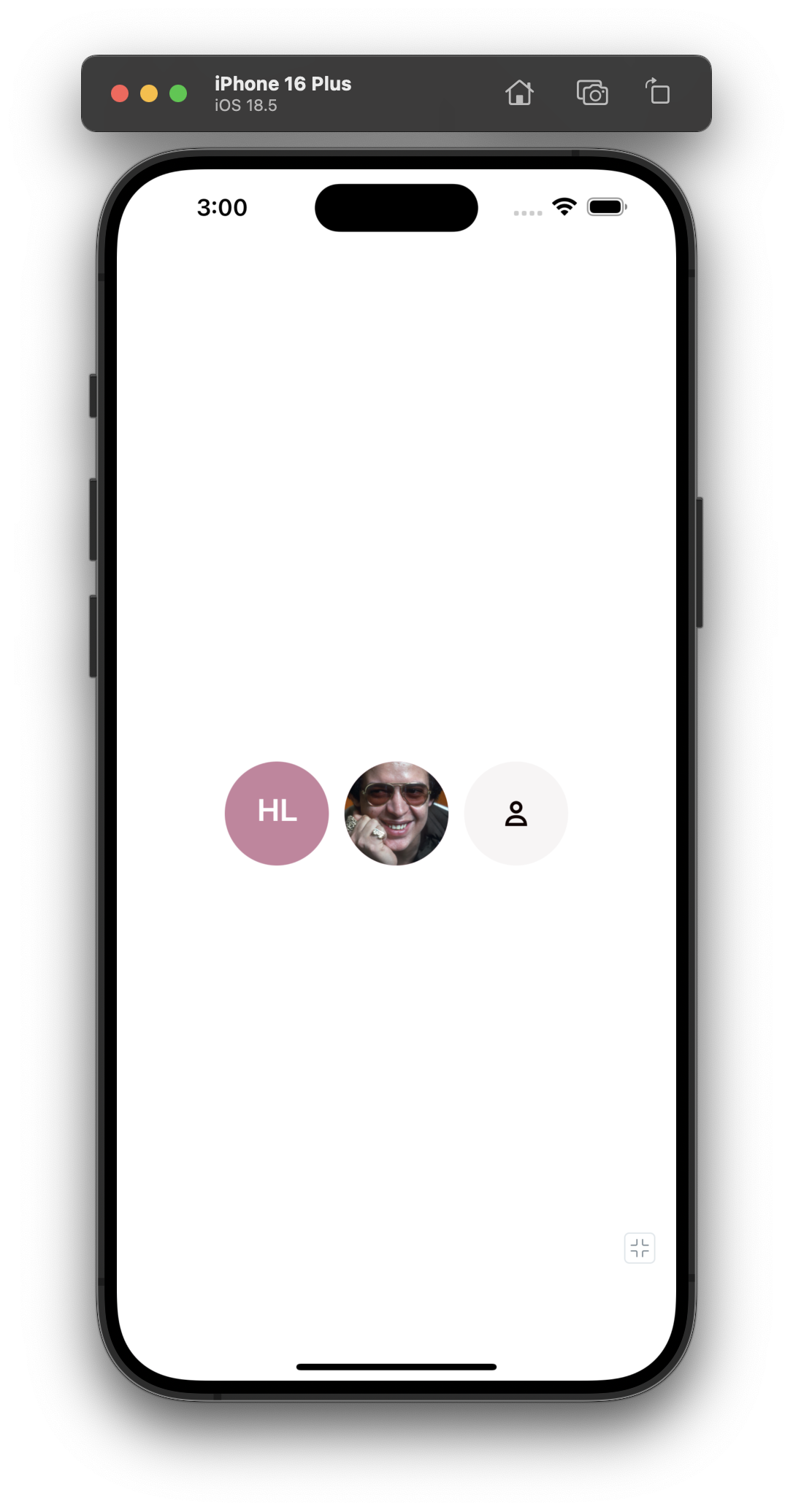
You can pass name and image to Avatar and it will do the best to determine
what to display. If nothing is passed, a fallback "user profile" icon will be
rendered.
import { XStack, Avatar } from '@hoverinc/design-system-react-native';
const App = () => (
<XStack gap="$300">
<Avatar name="Héctor Lavoe" />
<Avatar name="Héctor Lavoe" image="https://i.pravatar.cc/150?u=hector" />
<Avatar />
</XStack>
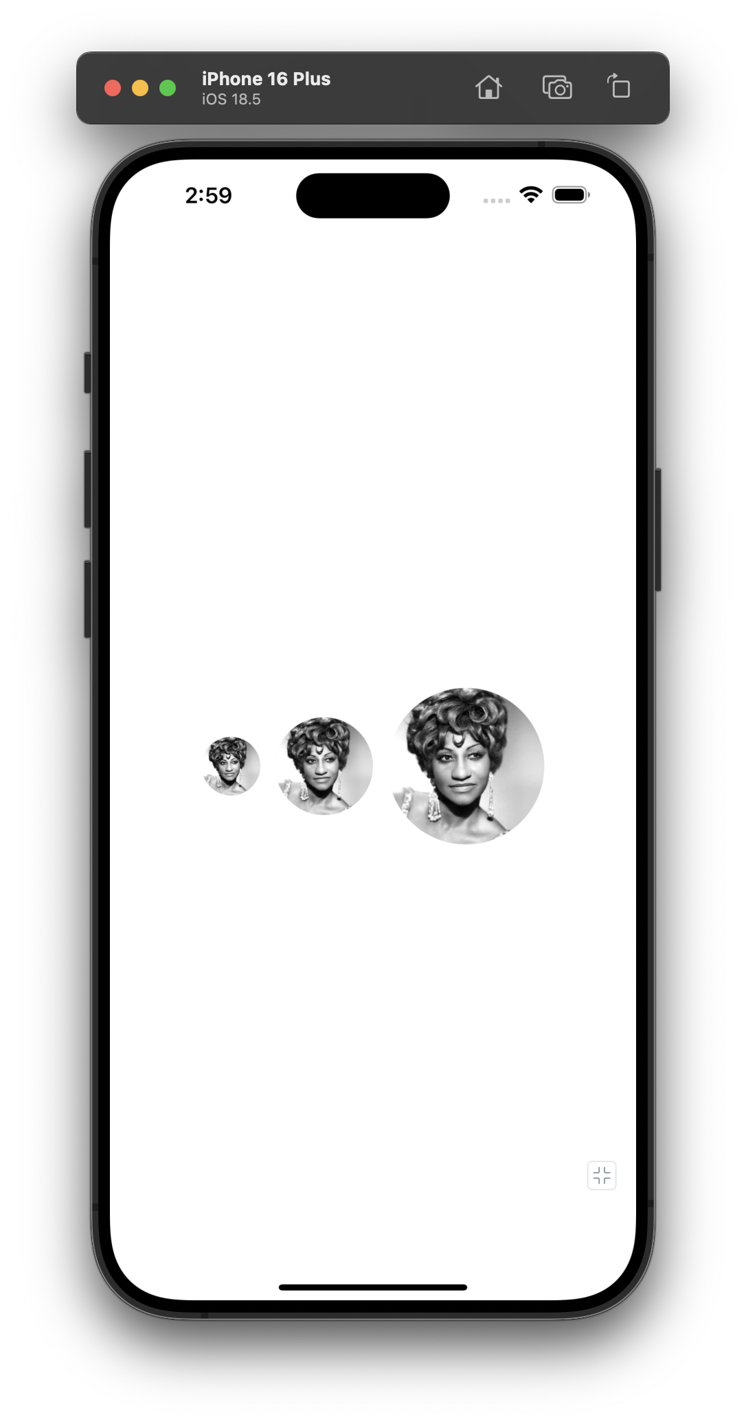
);Size
There are three sizes available.
import {
  XStack,
  Avatar,
  AvatarSizes,
} from '@hoverinc/design-system-react-native';

const App = () => (
  <XStack gap="$300">
    <Avatar
      size={AvatarSizes.Small}
      name="Celia Cruz"
      image="https://i.pravatar.cc/150?u=celia"
    />
    <Avatar
      size={AvatarSizes.Medium}
      name="Celia Cruz"
      image="https://i.pravatar.cc/150?u=celia"
    />
    <Avatar
      size={AvatarSizes.Large}
      name="Celia Cruz"
      image="https://i.pravatar.cc/150?u=celia"
    />
    <Avatar />
  </XStack>
);
AvatarGroup
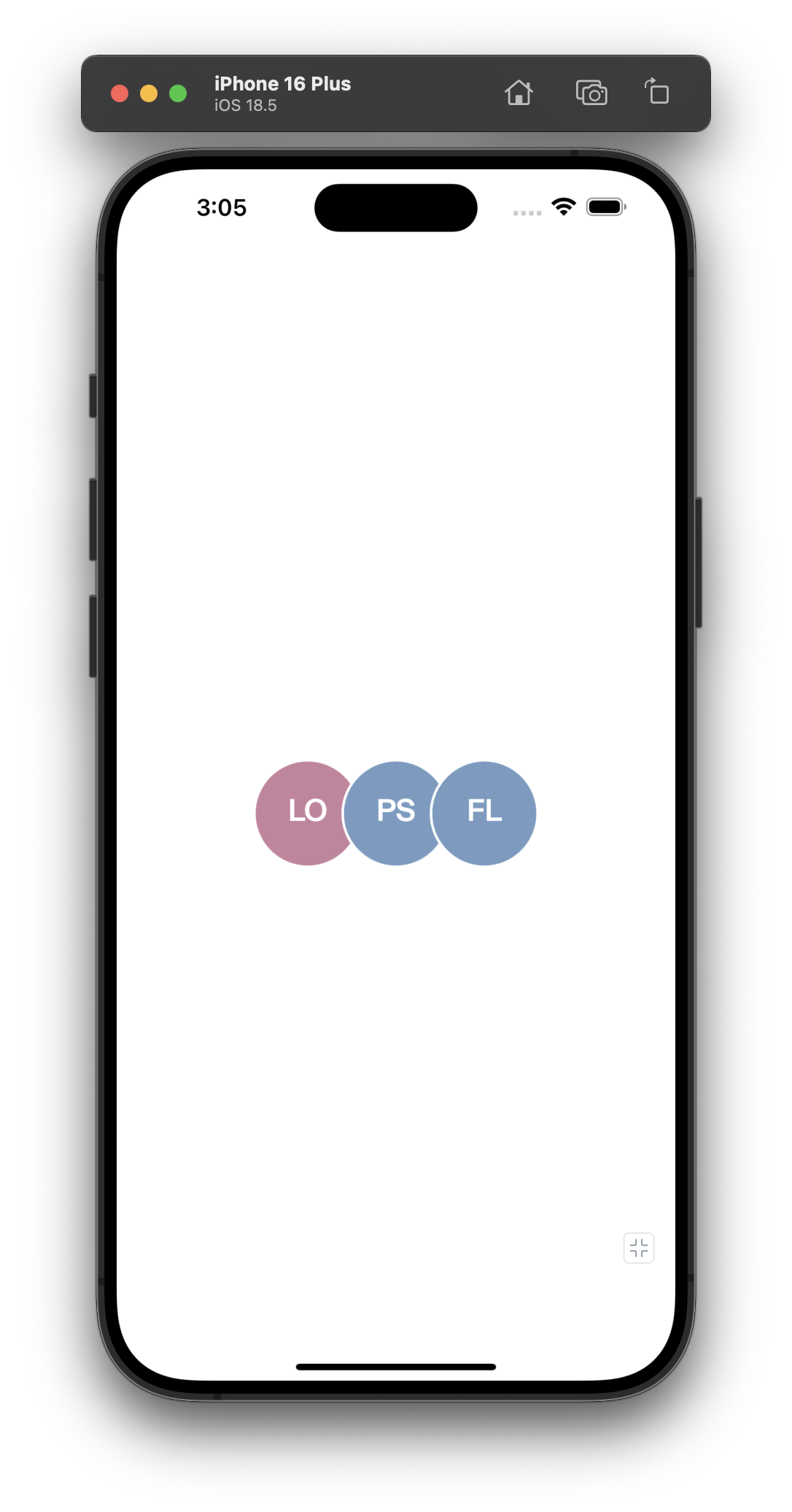
We support grouping/stacking of Avatar via the AvatarGroup component.
import { Avatar, AvatarGroup } from '@hoverinc/design-system-react-native';

const App = () => (
  <AvatarGroup max={3}>
    <Avatar name="Luiz Ortega" />
    <Avatar name="Paulo Sonoplasta" />
    <Avatar name="Francisco Labirintite" />
    <Avatar name="Marcela Mil Grau" />
    <Avatar name="Toninho do Diabo" />
    <Avatar name="Carina Medeiros" />
  </AvatarGroup>
);
Avatar Color Utility
The getAvatarColor utility function returns a consistent color for a given
name. This is useful when you need to use the avatar color outside of the Avatar
component, such as for custom UI elements or cross-platform applications.
The function returns tokens for both web and native platforms, plus the hex value
import { getAvatarColor } from '@hoverinc/blueprint-theme';

const color = getAvatarColor('Jane Smith');
// Returns: { web: 'brandPurple.500', native: '$brandPurple500', hex: '...' }

// Web (Chakra)
<Box backgroundColor={color?.web}>...</Box>

// React Native (Tamagui)
<Stack backgroundColor={color?.native}>...</Stack>

// Raw hex for any context
<div style={{ backgroundColor: color?.hex }}>...</div>