Design System

Radius

We use three border radius sizes to create a consistent, approachable look across our UI.

Apply them based on component type, hierarchy, and visual balance.
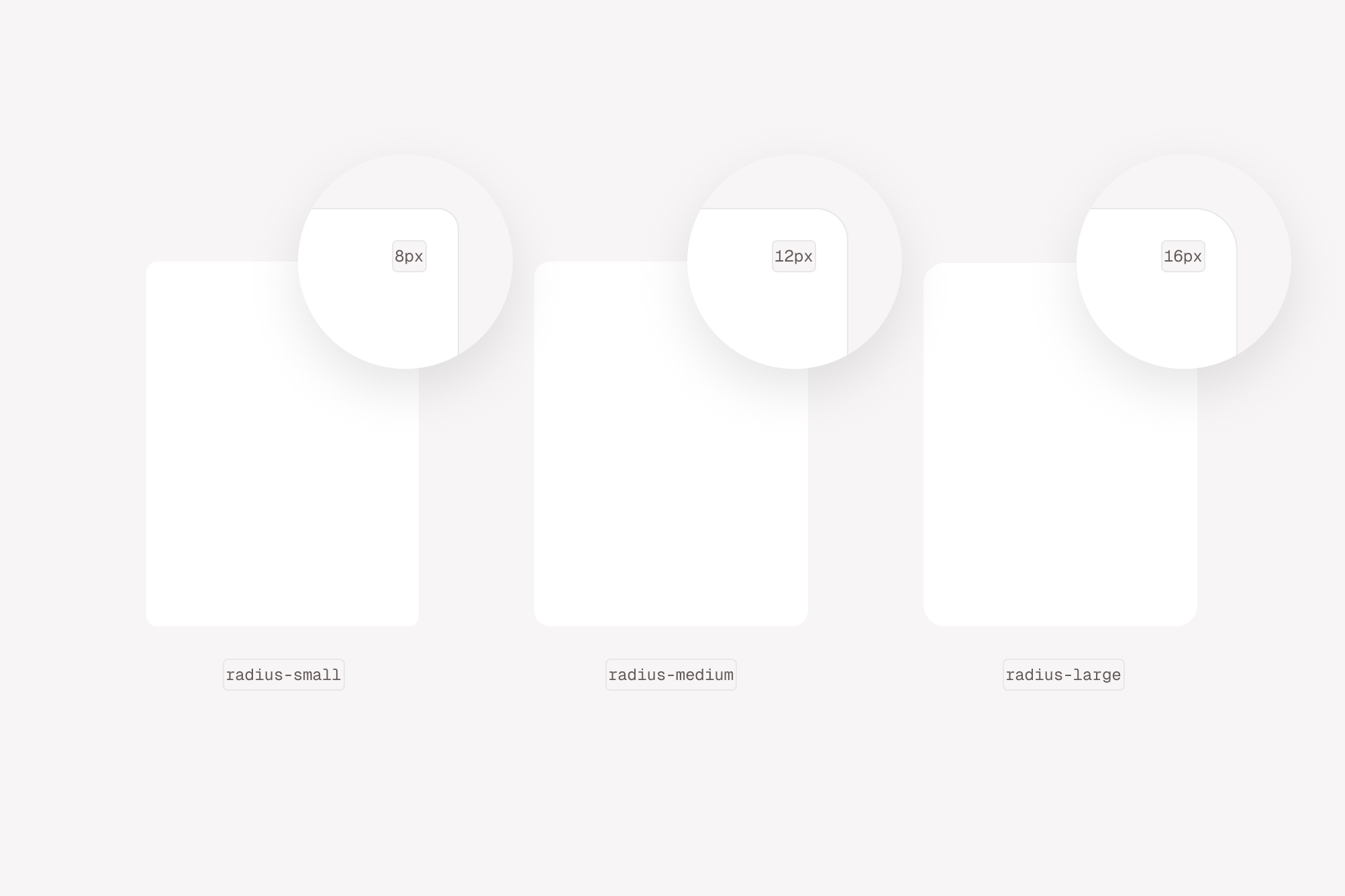
Three rectangles with varying degree of corner radiuses (8px, 12px, 16px)

Radius scale

Token nameValue
300 or small8px
350 or medium12px
400 or large16px
round or full999999px

Usage

System border tokens are available for the border-radius, border-width and border-color CSS properties. Border tokens can also be applied with presets that include all three properties preconfigured for specific use-cases.

React

Individual border properties can be set with the corresponding style props of borderRadius, borderWidth, and borderColor. Border presets are applied via the border style prop.

Radius scale

live

<Stack direction="row" spacing="400">
<Panel
as={Center}
border="neutral"
height="600"
width="600"
borderRadius="300"
>
300
</Panel>
<Panel
as={Center}
border="neutral"
height="600"
width="600"
borderRadius="350"
>
350
</Panel>
<Panel
as={Center}
border="neutral"
height="600"
width="600"
borderRadius="400"
>
400
</Panel>
<Panel
as={Center}
border="neutral"
height="600"
width="600"
borderRadius="round"
>
round
</Panel>
</Stack>

Border width

live

<Stack direction="row" spacing="400">
<Panel
as={Center}
border="neutral"
borderWidth="400"
height="600"
width="600"
>
400
</Panel>
<Panel
as={Center}
border="neutral"
borderWidth="500"
height="600"
width="600"
>
500
</Panel>
</Stack>


Copyright ยฉ 2025 Hover Inc. All Rights Reserved.