Foundations
Foundations establish the groundwork for design and engineering, from typography and color to layout and interaction. They create a shared language for cohesive and inclusive interfaces.

Breakpoints
They ensure layouts stay consistent, usable, and visually balanced on any device. By aligning on shared breakpoints, designers and engineers can create responsive experiences that scale seamlessly from mobile to desktop.

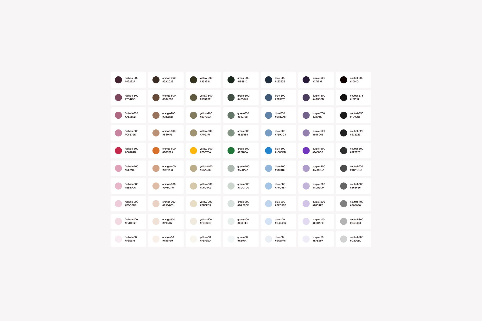
Color tokens
Our color system is built for clarity and scale. It starts with primitive values, mapped to global tokens for functional use, and extends to semantic tokens that convey state and meaning.
Favicon
Our favicon represents Hover across browser tabs, bookmarks, and search results. We use two versions. Fuchsia for the main Hover brand, and black and white for non-core products like this site. The secondary favicon includes an inverted variant to ensure visibility on different background colors. Use dynamic theming (prefers-color-scheme) if supported.

Grids
Our grid system creates structure, rhythm, and balance across every screen size. Built on a responsive framework, it adapts fluidly from XS (375px, 4 columns) to XL (1920px, 12 columns), with consistent 24px gutters and flexible margins. Whether you're designing for mobile or widescreen, the grid provides a reliable foundation for layout clarity and alignment.

Icons
Our icon set is fully custom-made to ensure a cohesive and unique visual language.
Use the appropriate size based on platform conventions and visual hierarchy.
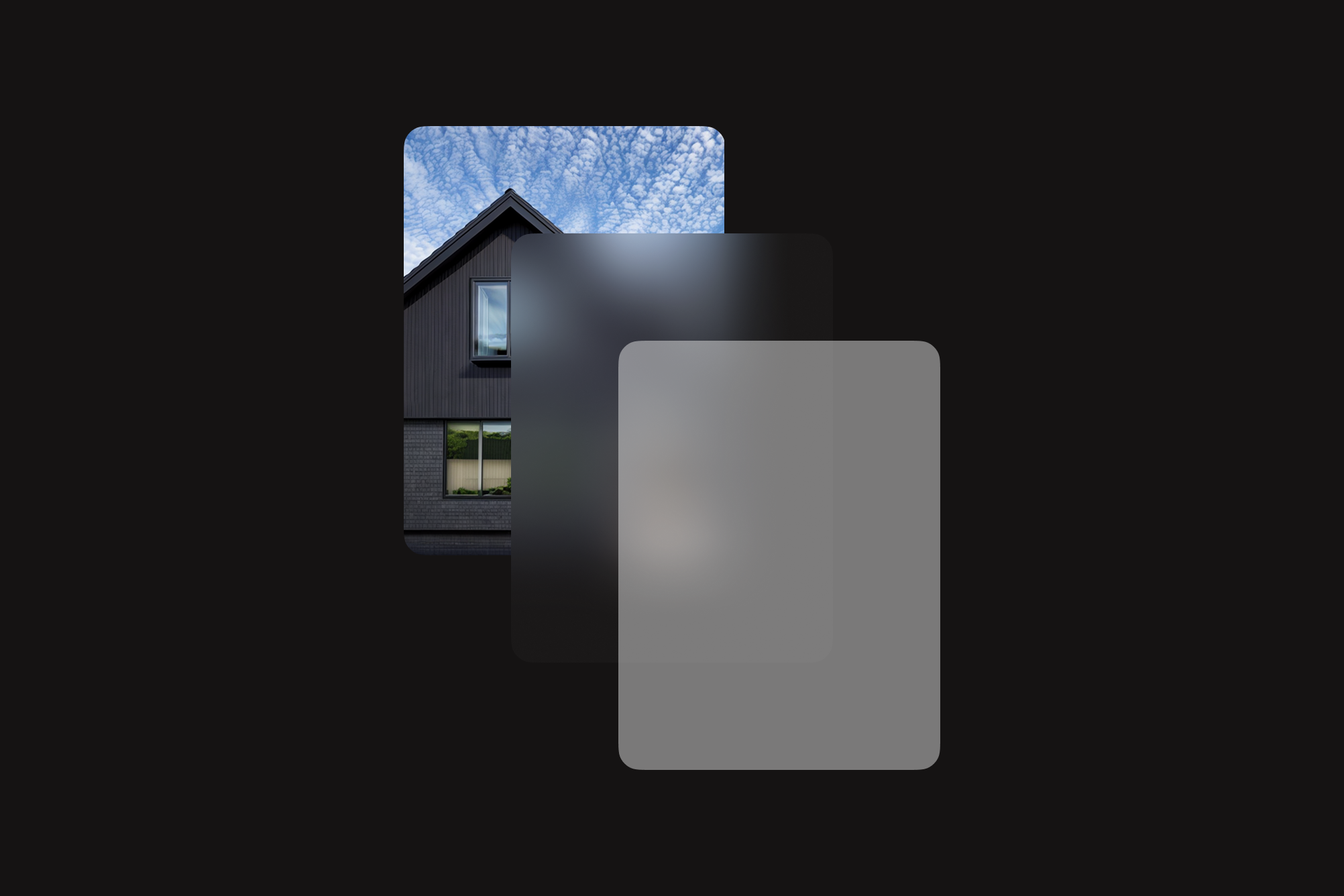
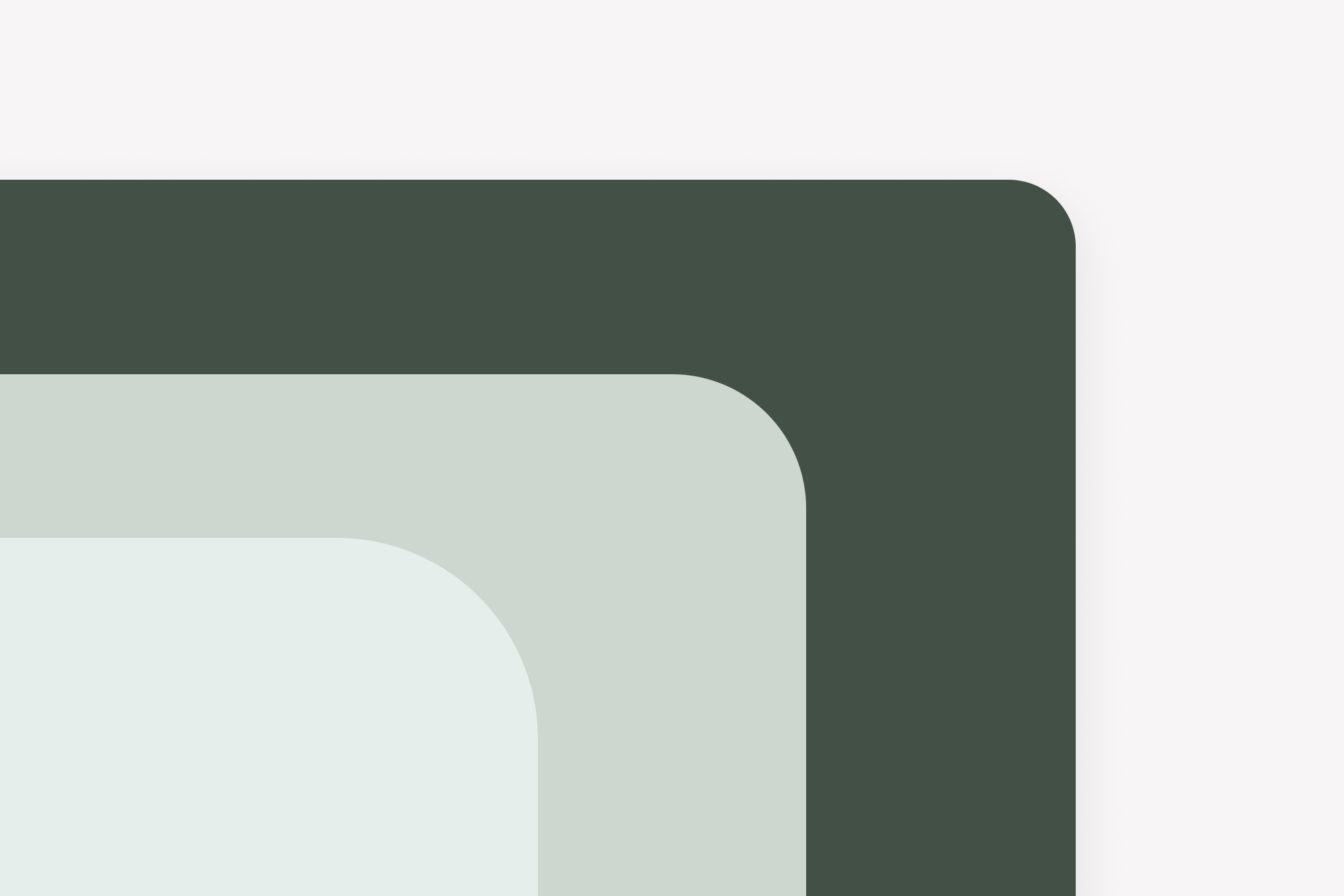
Layers
Layers are sets of styles that can be applied to any container. They separate the container visually from its background content.
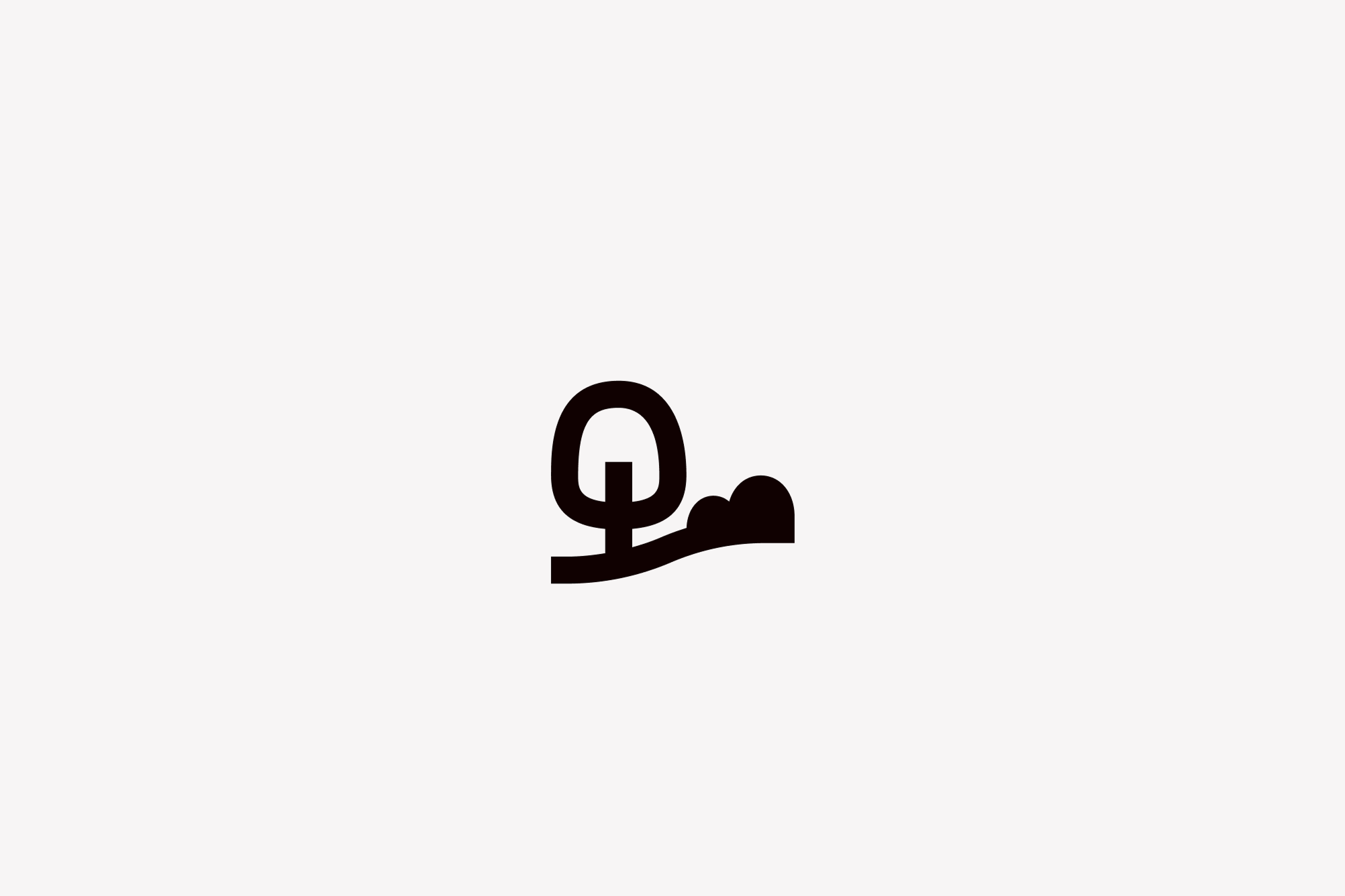
Logo
Our logo comes in two variants: one for light backgrounds and one for dark backgrounds.
Always use the correct version to ensure visibility and brand consistency.
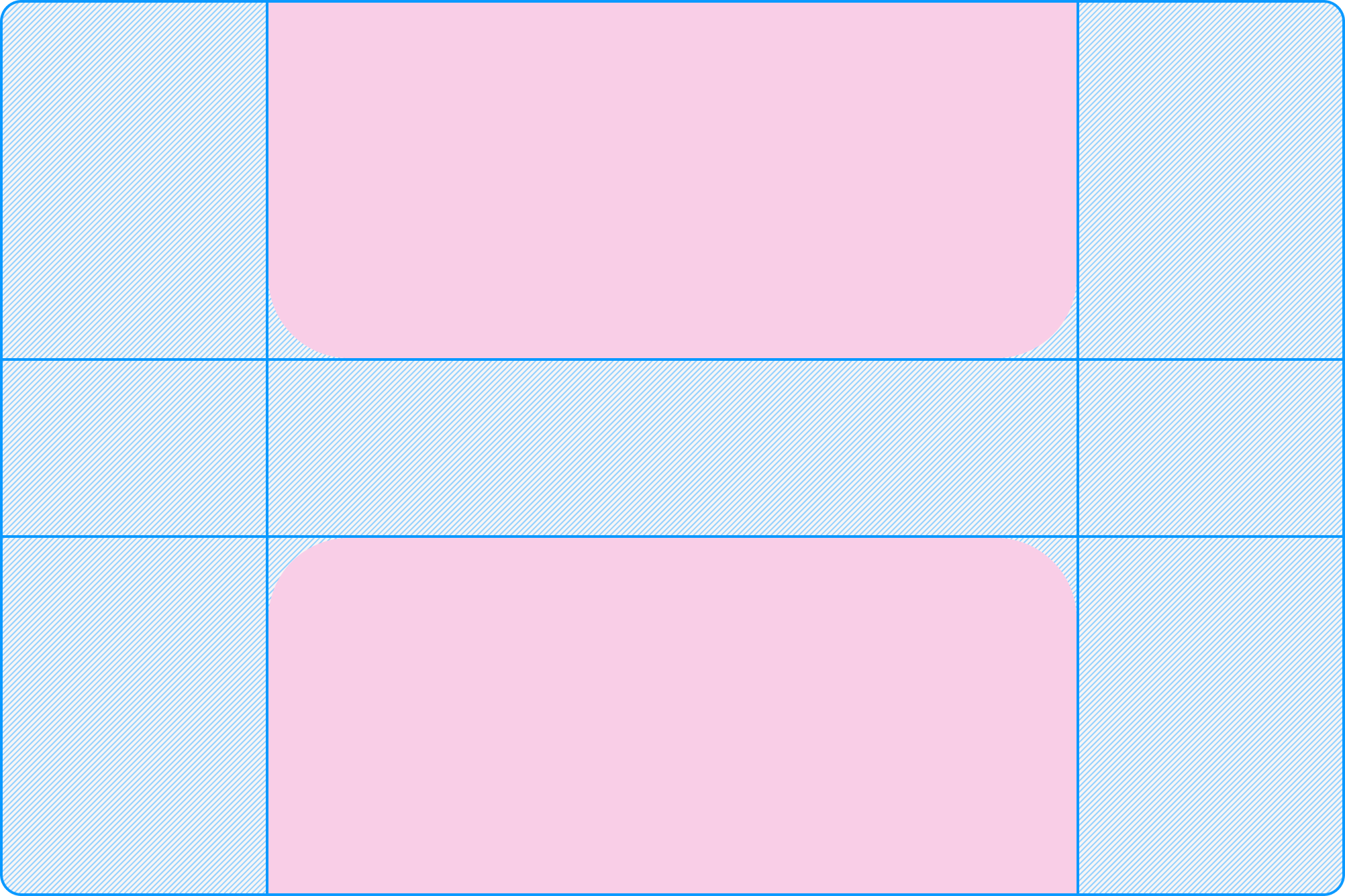
Radius
We use three border radius sizes to create a consistent, approachable look across our UI:
- Small 8px
- Medium 12px
- Large 16px
Apply them based on component type, hierarchy, and visual balance.
Shadow
We use a single, consistent shadow to add depth without distraction.
- Default shadow—0px x, 15px y, 44px blur, 0px spread
- Color—#000000 at 10% opacity
Designed to be subtle yet effective across light and dark surfaces.
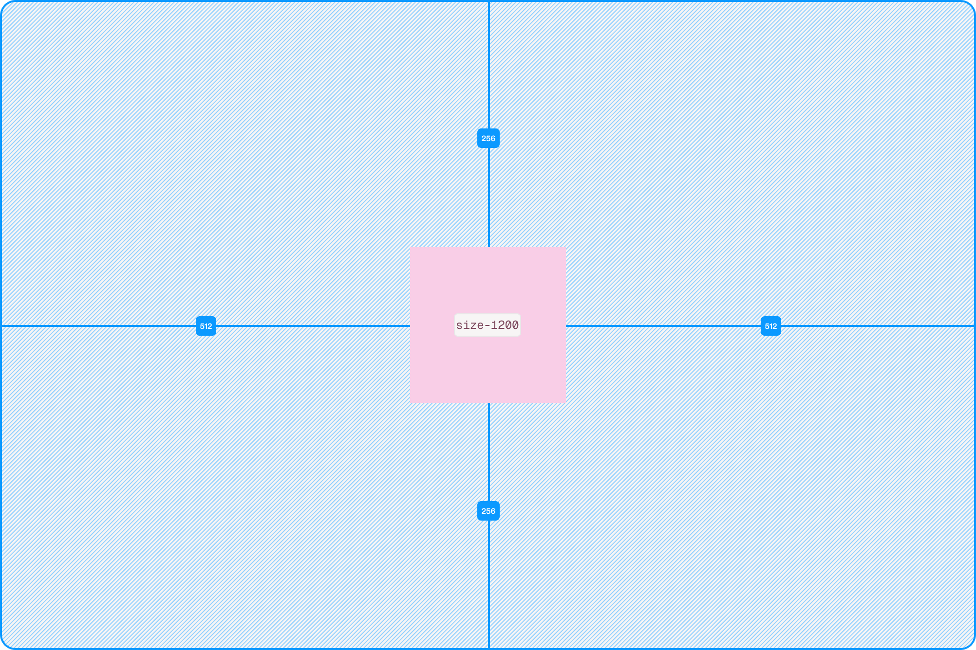
Size tokens
The size scale helps maintain consistent sizing of elements. This scale applies primarily to width and height.
Spacing tokens
The space scale helps maintain consistent spacing around and between elements. This scale applies primarily to margin, padding, spacing and gap.
Typography
Our typographic system is built around Hover Diatype, a custom typeface designed to reflect our brand’s character. With a range from 12px to 80px in consistent 4px increments, our scale offers both flexibility and precision—ensuring hierarchy, readability, and visual harmony across every screen and experience.

AI
The docs site publishes machine-readable snapshots of its content for AI
assistants and coding agents that follow the
llms.txt convention. Each snapshot is a single
markdown index plus a tree of per-document markdown files, regenerated on
every build, so an agent always reads what humans see today on the site.
We publish two flavors so agents only see the surface that matches the target runtime:
/llms.txt: the React (Blueprint) build. Covers components, hooks, and patterns from@hoverinc/design-system-react-web./llms-rn.txt: the React Native (Tamagui) build. Covers components, tokens, and conventions from@hoverinc/design-system-react-native.
Per-document markdown is also available under /llms/ and /llms-rn/ for
agents that prefer to fetch single pages on demand. Point your agent at the
flavor that matches the project you're working in.