Forms
Forms combine multiple components to capture and validate user input.
Explore the components that make up a form and see best practices for structure, accessibility, and usability.

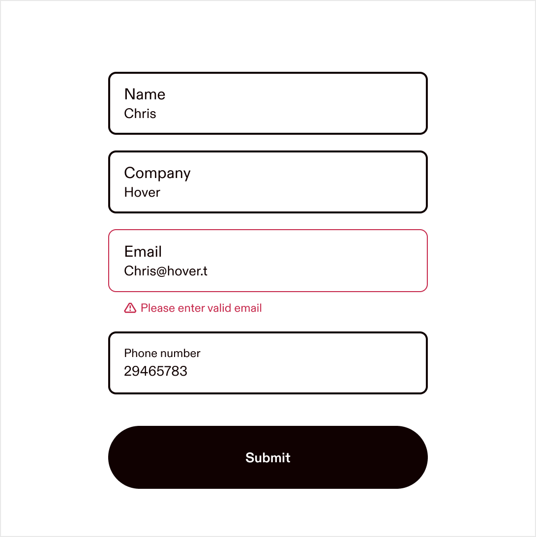
Form validation and feedback
Design principles for handling input states, errors, and success.
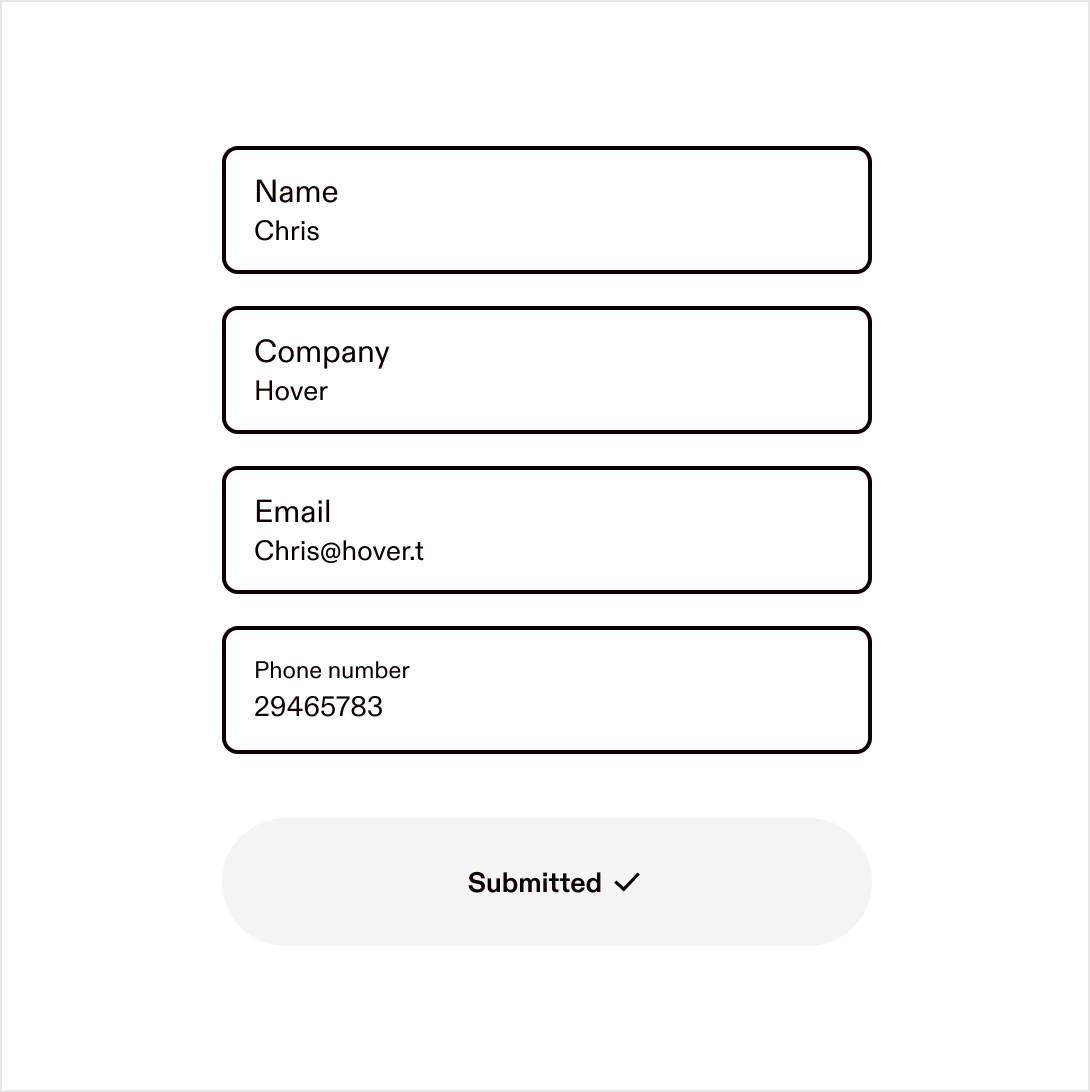
Always editable
Keep all input fields editable at all times.
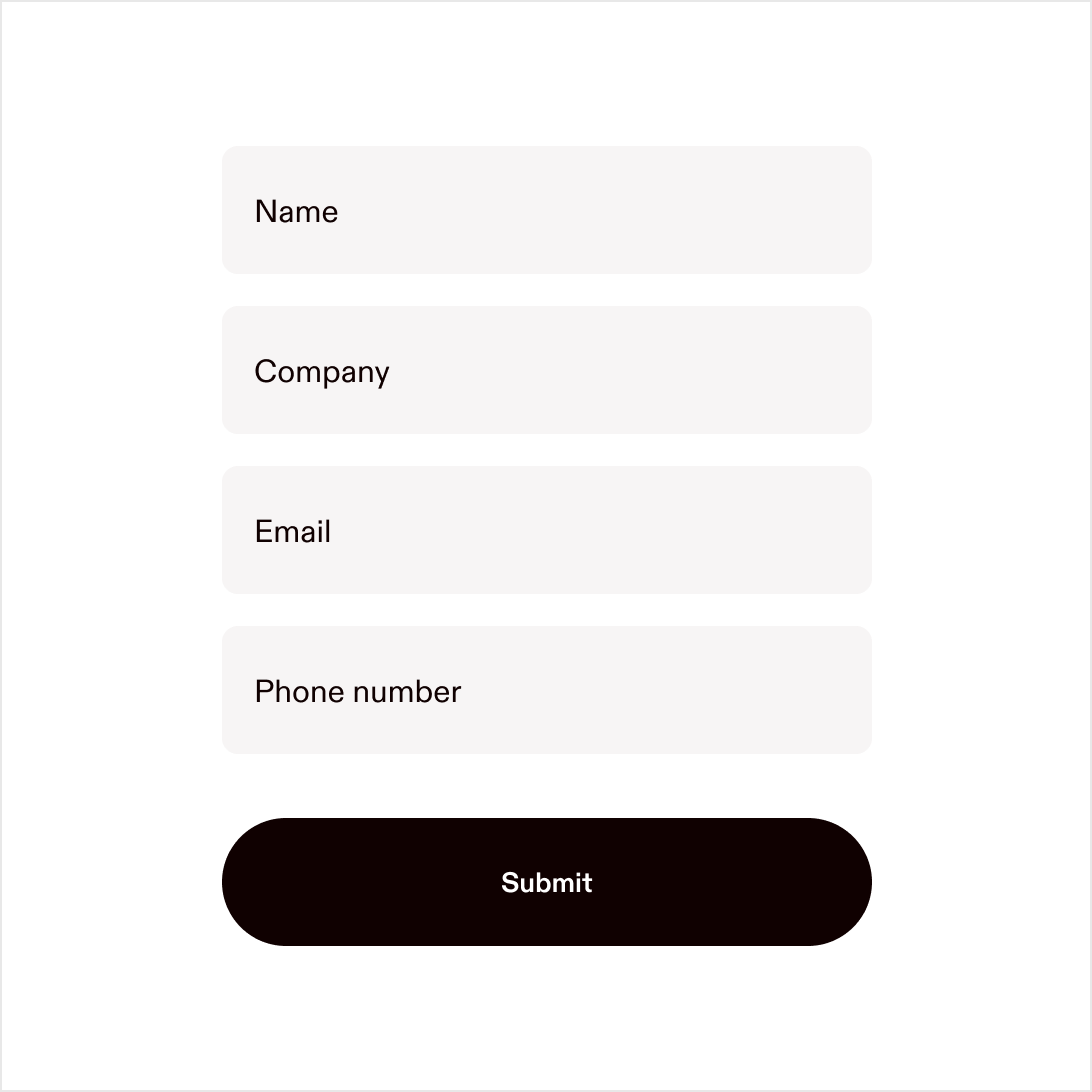
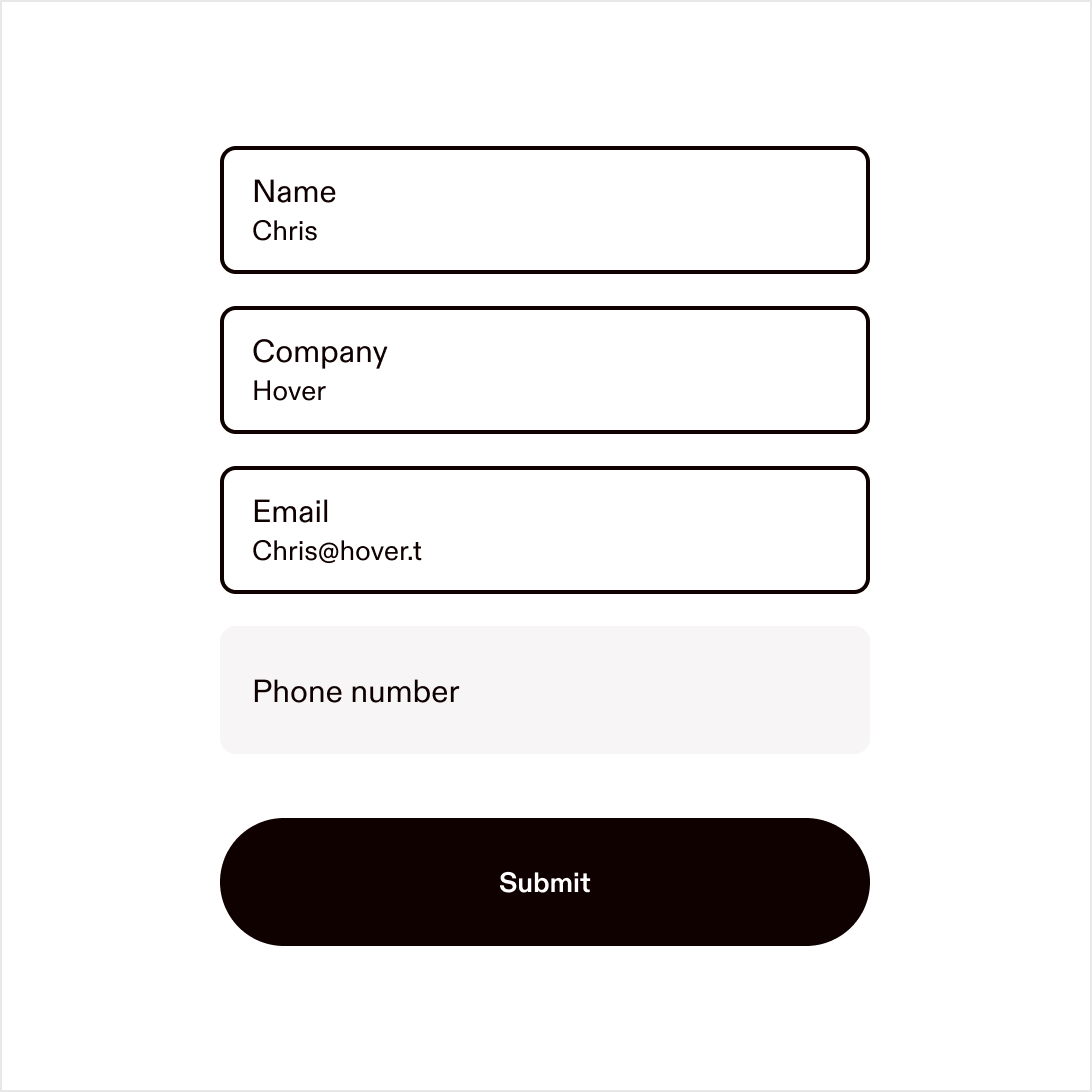
Clear labels
Use clear, sentence-case labels and messages throughout.
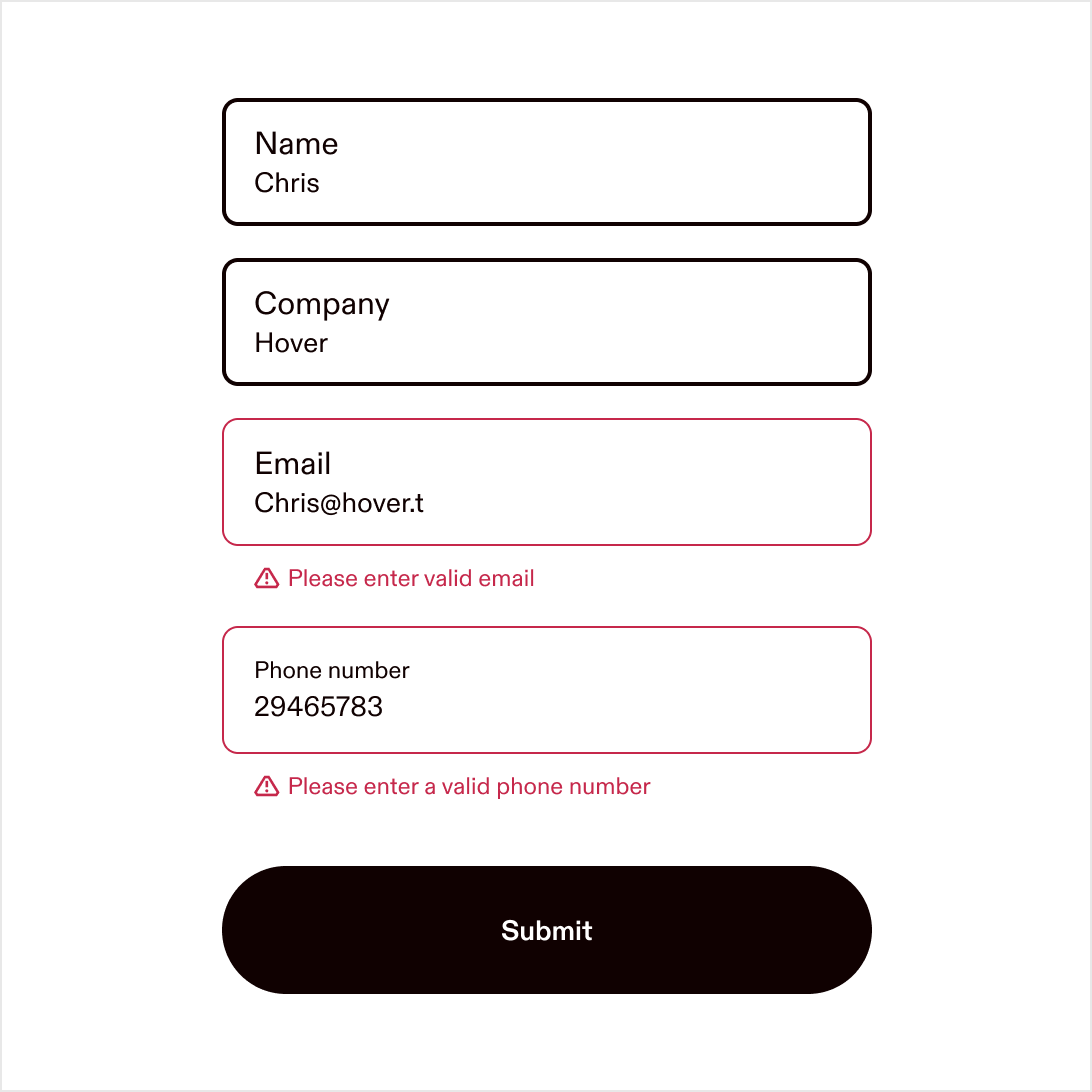
Inline errors
Use inline error messages directly below the field they relate to.
Avoid toast
Avoid using toasts or modals for form errors or confirmations.
Inline success
Display success feedback inline, close to the action (e.g. on the button). Success should feel effortless. If no redirect occurs, keep users oriented with subtle in-context confirmation.