Shadow
We use a single, consistent shadow to add depth without distraction. Designed to be subtle yet effective across light and dark surfaces. Designed to be subtle yet effective across light and dark surfaces.
- Default shadow: 0px x, 15px y, 44px blur, 0px spread
- Color: #000000 at 10% opacity
React
A set of shadow presets are available to be applied to any system component via
the shadow or boxShadow style prop.
Shadow
Standard shadows are used to create the appearance of depth or layers.
<Panel as={Center} height="600" shadow="default">
  default
</Panel>
Inset
Inset shadows are the inverse of distance, for creating an inlay effect.
<Stack direction="row" spacing="400">
  <Panel as={Center} height="600" shadow="inset100">
    inset100
  </Panel>
  <Panel as={Center} height="600" shadow="inset200">
    inset200
  </Panel>
</Stack>
Halo
Border effects applied via CSS box-shadow prevent affecting the dimensions of
a container. This method is typically used to indicate focus or selection.
<Stack direction="row" spacing="400">
  <Panel shadow="haloNeutral" as={Center} height="600">
    haloNeutral
  </Panel>
  <Panel shadow="haloPrimary" as={Center} height="600">
    haloPrimary
  </Panel>
  <Panel shadow="haloDanger" as={Center} height="600">
    haloDanger
  </Panel>
  <Panel shadow="haloWarning" as={Center} height="600">
    haloWarning
  </Panel>
  <Panel shadow="haloSuccess" as={Center} height="600">
    haloSuccess
  </Panel>
</Stack>
Ring
Ring is similar to Halo above, but thinner.
<Stack direction="row" spacing="400">
  <Panel shadow="ringNeutral" as={Center} height="600">
    ringNeutral
  </Panel>
  <Panel shadow="ringPrimary" as={Center} height="600">
    ringPrimary
  </Panel>
</Stack>
Deprecated
These distance values are deprecated in favor of a singular default style.
They will be removed in a future version.
<Stack direction="row" spacing="400">
  <Panel as={Center} height="600" shadow="distance100">
    distance100
  </Panel>
  <Panel as={Center} height="600" shadow="distance200">
    distance200
  </Panel>
  <Panel as={Center} height="600" shadow="distance300">
    distance300
  </Panel>
  <Panel as={Center} height="600" shadow="distance400">
    distance400
  </Panel>
  <Panel as={Center} height="600" shadow="distance500">
    distance500
  </Panel>
  <Panel as={Center} height="600" shadow="distance600">
    distance600
  </Panel>
</Stack>
React Native
To achieve drop shadow effect in React Native you can leverage the Shadow
component, which builds on top of Stack and leverages the
boxShadow property
available in React Native 19 through the New Architecture.
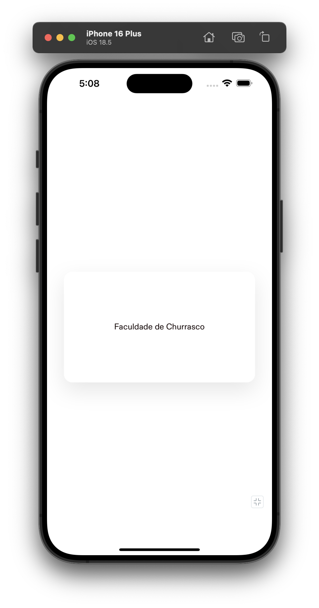
import { Body, Shadow } from '@hoverinc/design-system-react-native';

const App = () => (
  <Shadow
    alignItems="center"
    borderRadius="$large"
    justifyContent="center"
    padding="$1000"
  >
    <Body>Faculdade de Churrasco</Body>
  </Shadow>
);